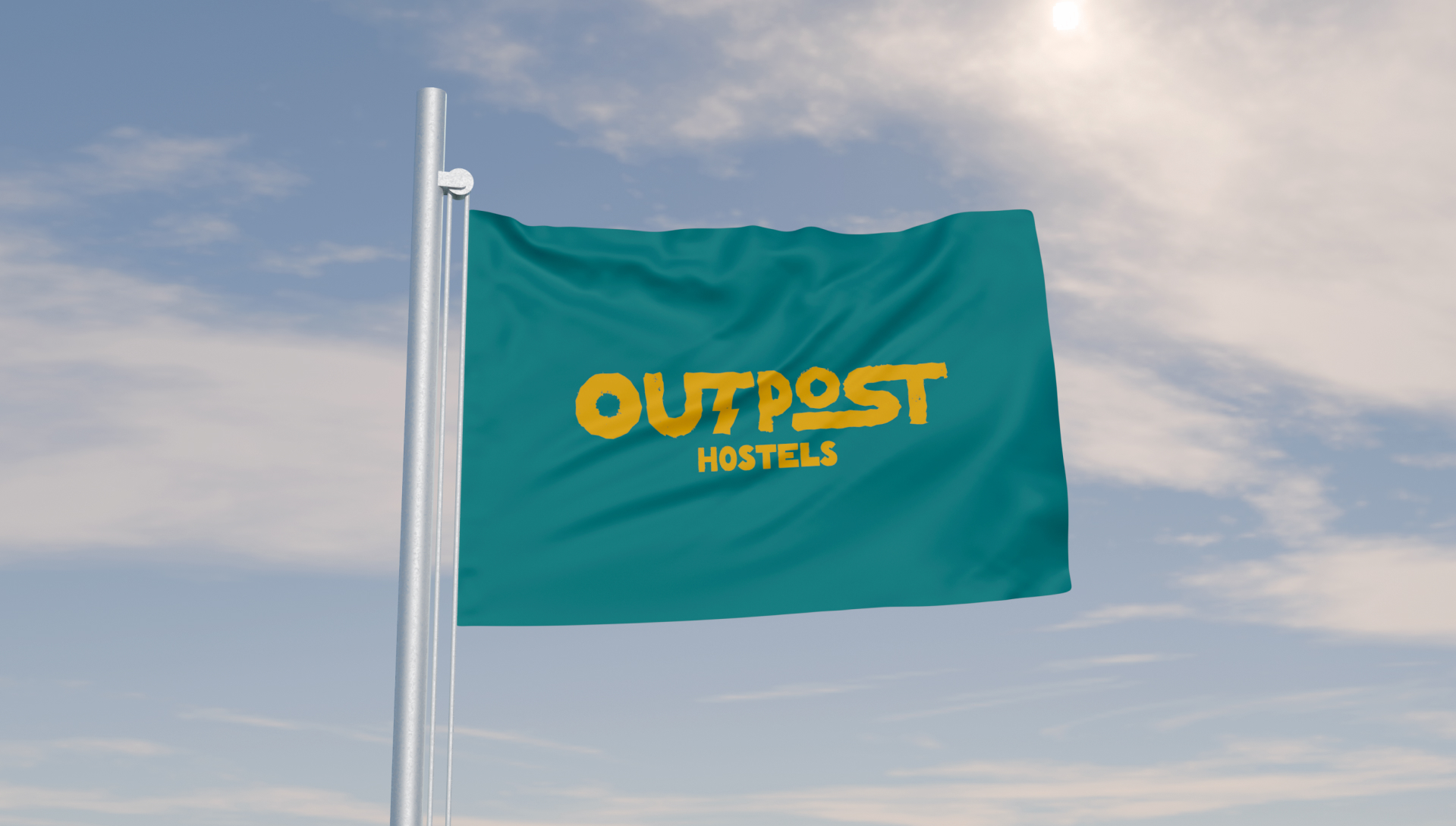
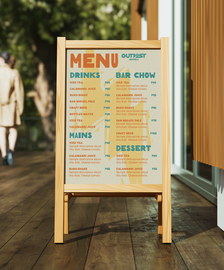
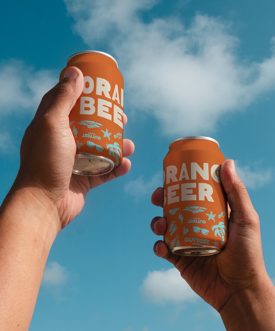
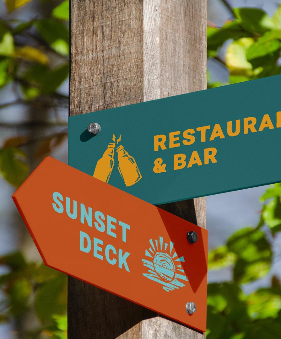
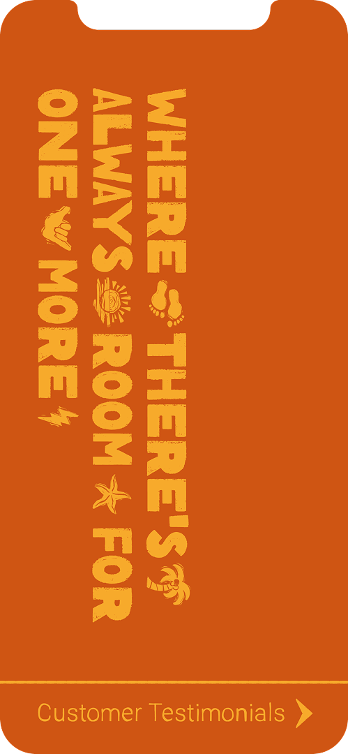
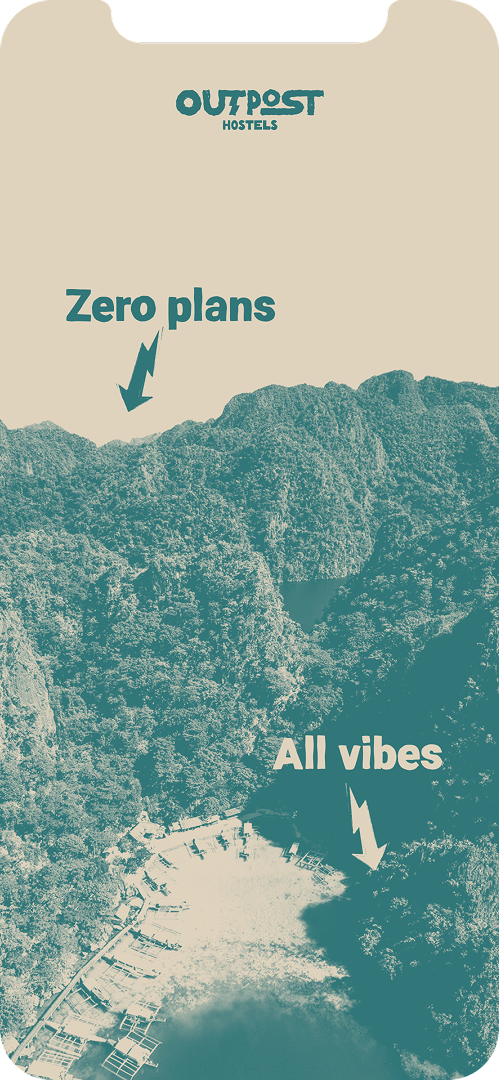
A full rebranding project for a Philippine-based hostel chain. Outpost Hostels consistently maintain a strong reputation as a premier destination for social travelers across both its key Palawan locations. Its brand identity is robustly built on fostering connections and unforgettable experiences.
Services
Brand Foundations, Full Branding, Verbal Identity, Visual Identity
Rooted in Real,
Built for More
After several years in the business, the Outpost team wanted to elevate their branding by perfectly encapsulating their culture of fostering authentic community, creating memorable adventures, and cultivating memorable adventures. Aside from solidifying their identity for future expansion, they were looking to differentiate themselves from both of their more boisterous and boxed-in competitors. This branding hopes to show how we met them in the middle, combining their tone and look with their genuine personality.
Tactile & Hand-made
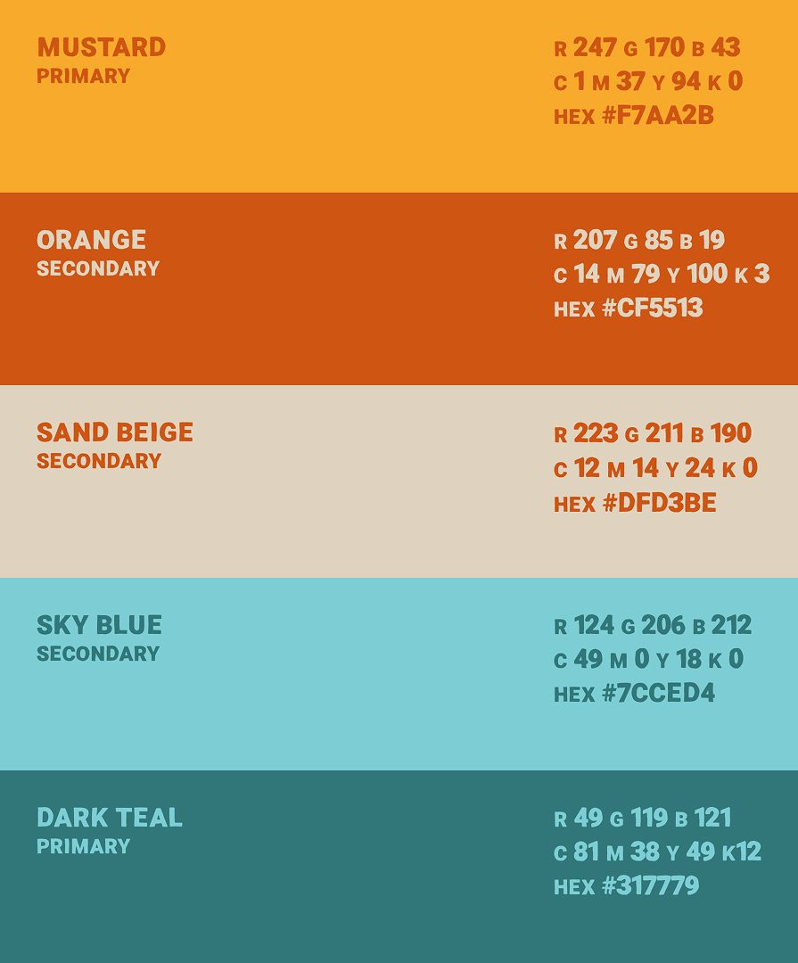
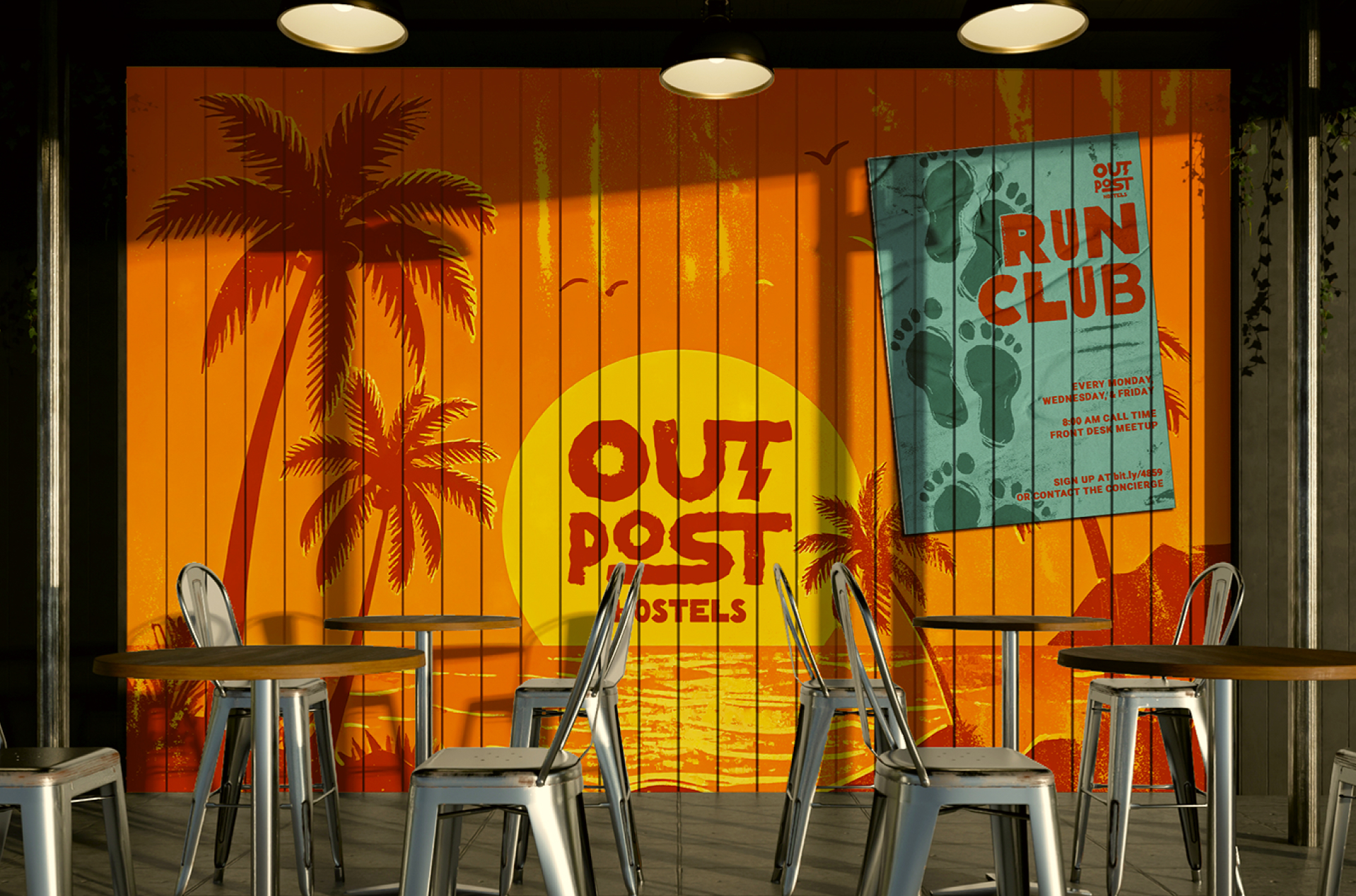
Through a brand audit and multiple interviews, the first thing the team wanted to introduce to their branding was using the concept of energy as a core value that drove how people experience their spaces. In response, we developed a visual identity that captures this energy through texture, movement, and a deliberate lack of rigidity.
Tactile & Hand-made
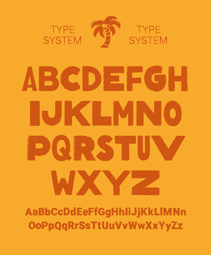
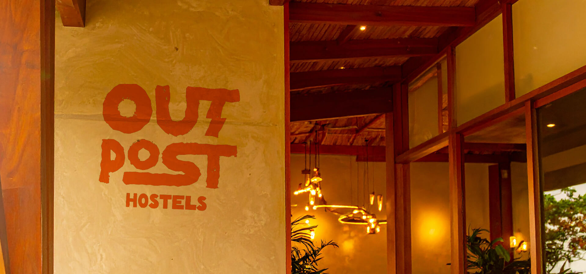
These aren’t just decorative; they’re designed to feel lived-in like the hand-painted signs on Outpost’s walls and the sun-faded posters from their team’s youth spent in California. This visual approach allows the brand to move fluidly between playfulness and clarity, giving just enough structure to communicate while still feeling spontaneous and human.
Community at its Core
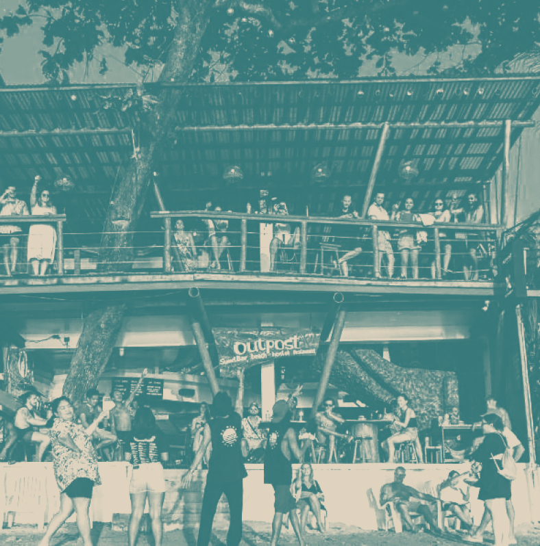
Through its “beach bum” simplicity, we endeavored to honor the locals who made the hostel what it is. Outpost’s tight-knit staff are the main event. We’re here to celebrate the people who have painted each mural by hand, and who have turned guests into old friends. They’re the reason why Outpost feels less like a stopover and more like a home that people want to go back to. This rebrand is a reflection of the warm soul behind the space and the people. Outpost’s identity now doesn’t just look the part; it feels it, because it’s designed from the inside out.
Lorem ipsum dolor sit amet, consectetur adipiscing elit. Sapien scelerisque magna venenatis non posuere vulputate viverra nunc