Sparking the Conversation
The challenge was clear: how do you get people to prepare for something they hope never happens? Fire safety had the reputation of being too technical, too distant, or too late. That conflict became our spark point. We saw an opportunity to turn cold warnings into clear and approachable messages. The visuals needed to say “This is serious,” without ever showing panic. The design needed to reassure as much as it informed, to feel competent without over-designing. What emerged was a brand that doesn’t scare; it prepares.
Fuel for the Flame
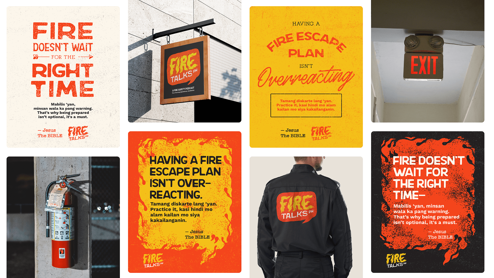
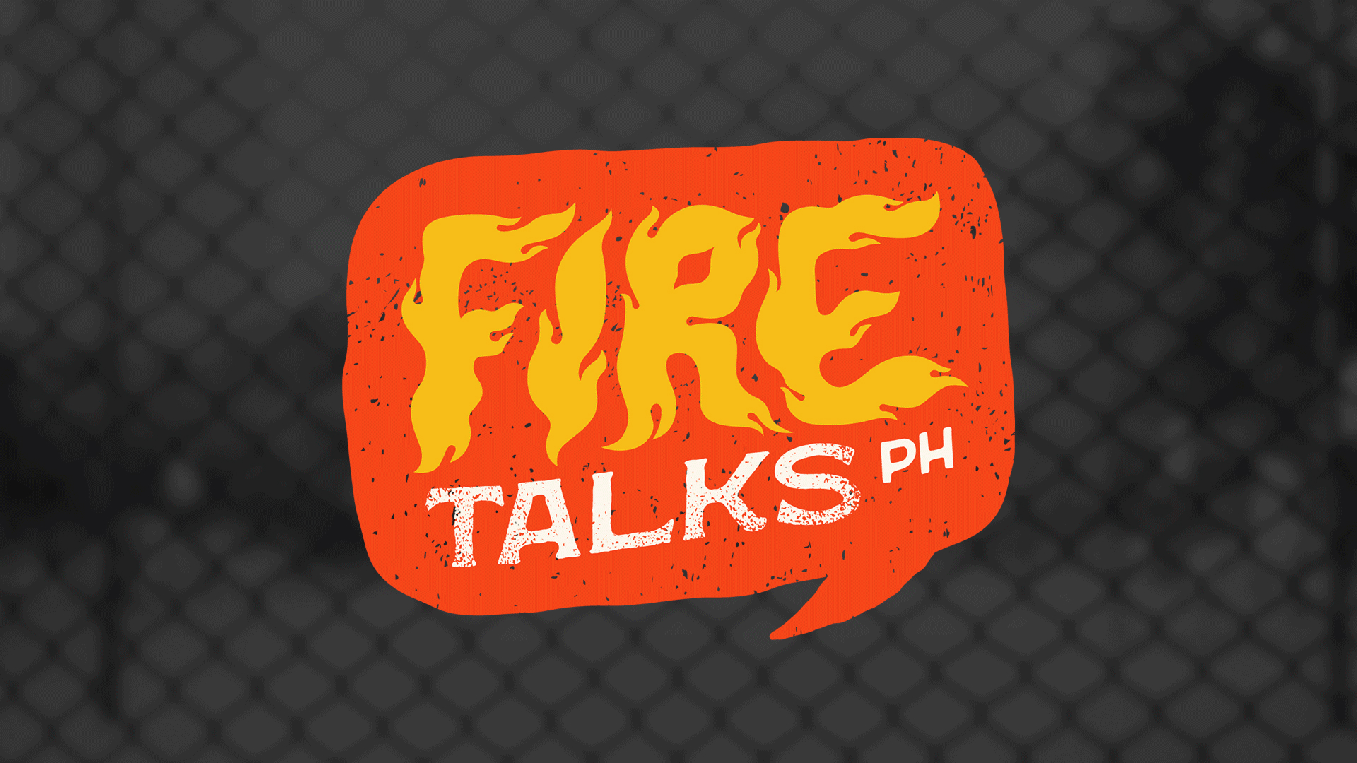
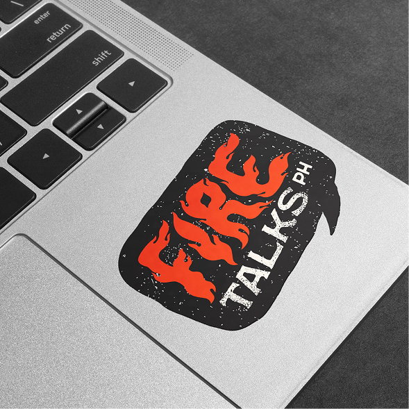
Our creative strategy leaned into the resilience, clarity, and honesty of industrial design. We drew from the visual language of vintage fire departments, utility labels, and safety signage to build something both dependable and human. The typography was chosen not just for its legibility, but for its quiet authority. Color was handled with care: red-orange and yellow for urgency, grounded always by deep charcoal tones. Gritty and worn surfaces gave the brand tactility, nodding to the imperfect, high-stakes environments of fire response. The logo, shaped like a speech bubble lit by flame, signals seriousness and dialogue in one stroke. The result was a system that could be flexible across social media posts, episode visuals, and printed handouts without losing its character. Our strategy emphasized giving fire safety a face people can trust.
The Afterglow
The identity smolders with timeless grit using daring typography and rich textures that speak of experience. Its bold palette and typography helped Fire Talks PH expand its message across more channels. Our branding system makes fire safety feel like advice from someone who’s been there without feeling too intimidating.
The result is a podcast that doesn’t just inform—it commands attention and earns trust. What once flickered quietly now burns steady, clear, and unmistakably bold.
Hot Takes
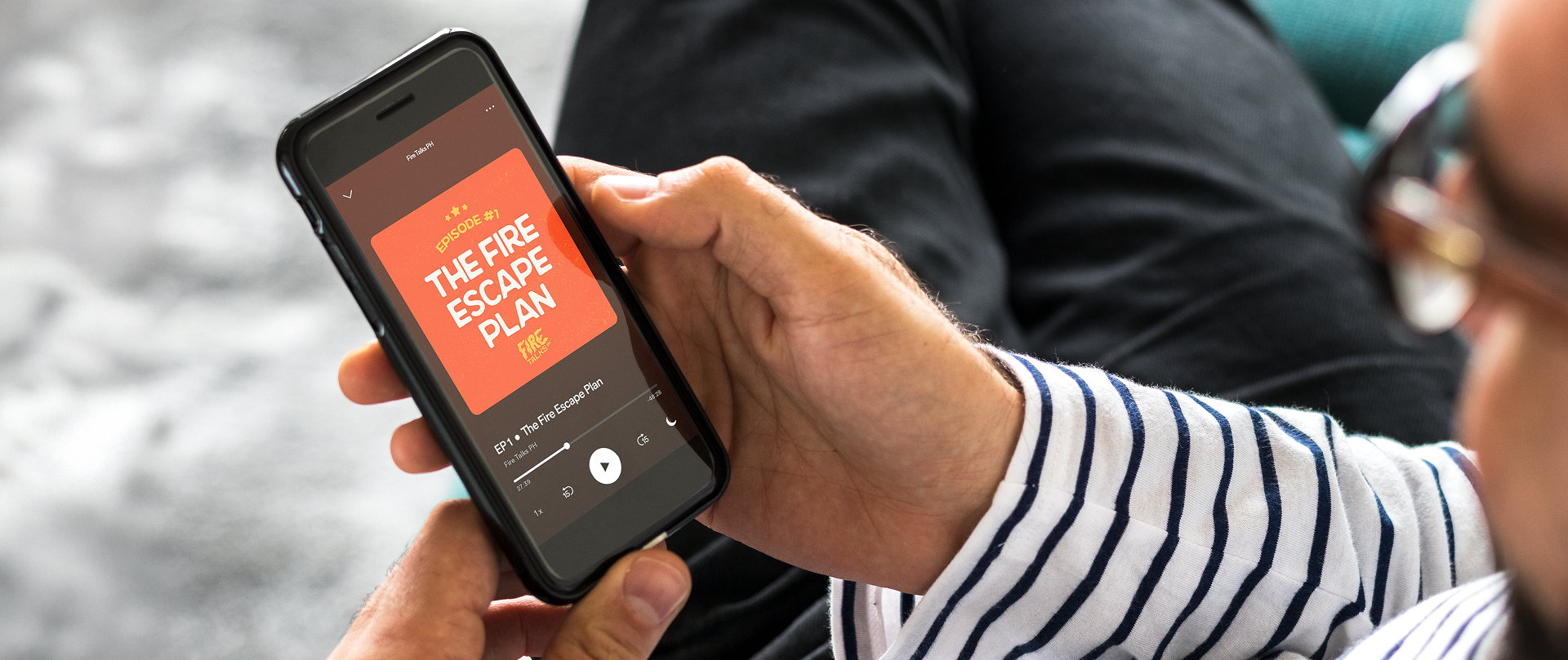
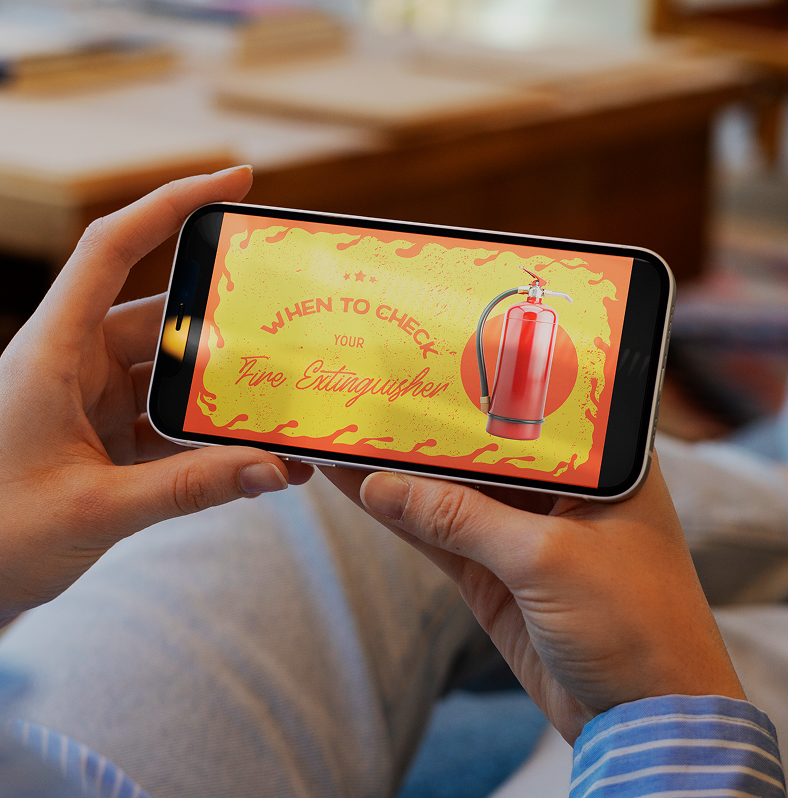
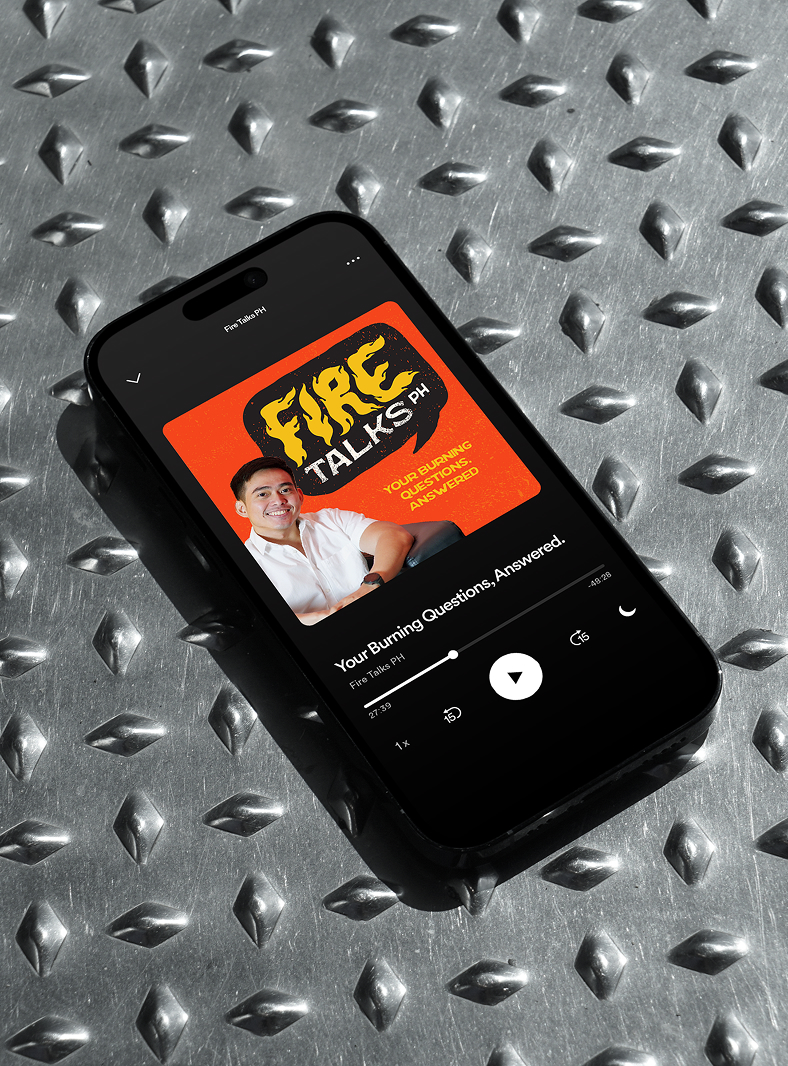
Some executions were required to burn a little brighter than the rest. The project called for applications across several branches of digital media. We surveyed the Filipino podcast covers that appear on streaming platforms and social media to determine what elements work best. We determined that a photograph of the humans behind the voice is key to building trust with the Filipino audience.
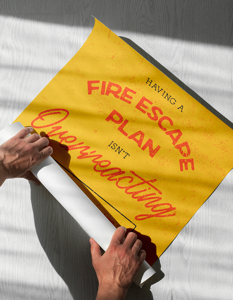
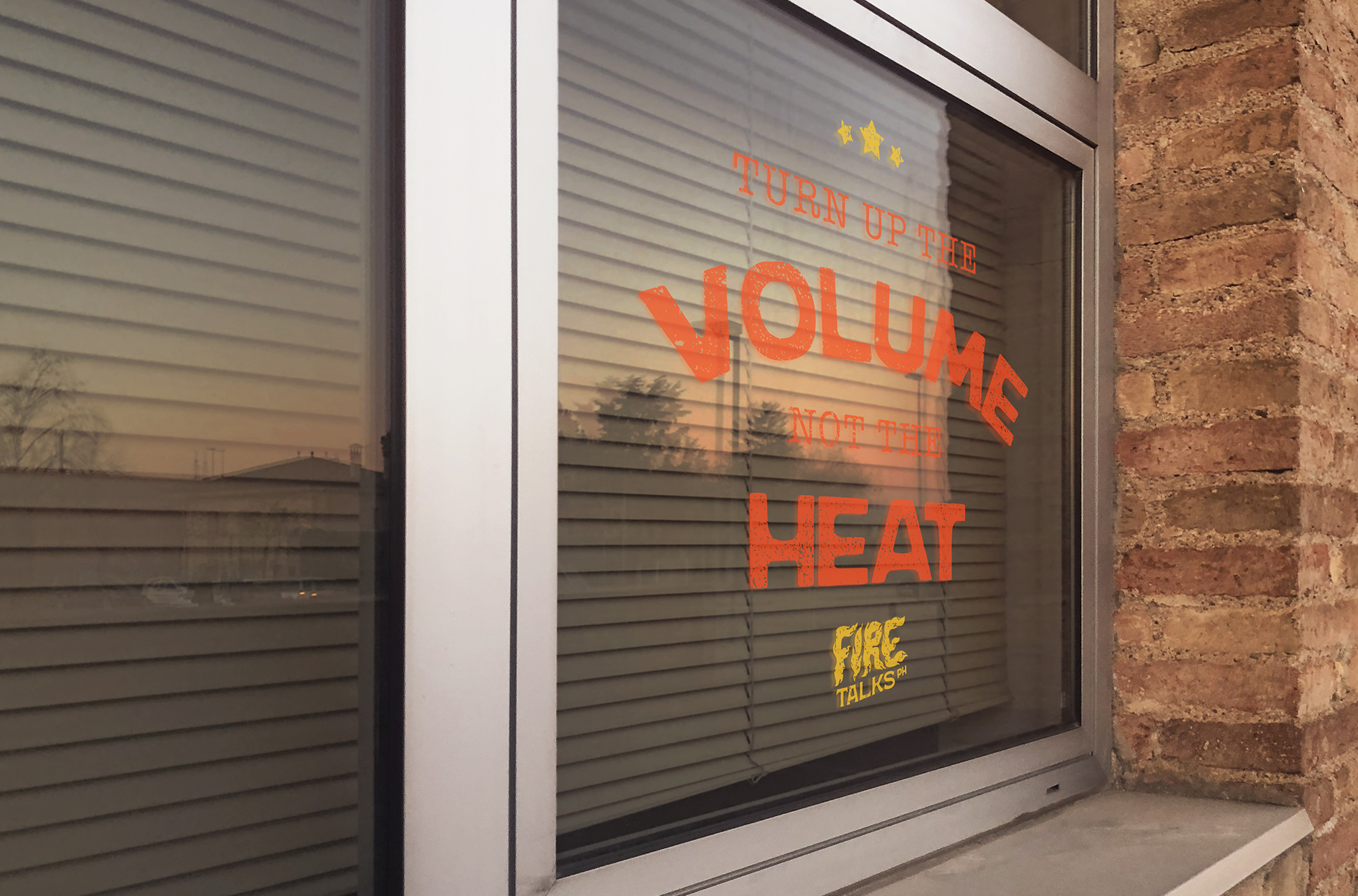
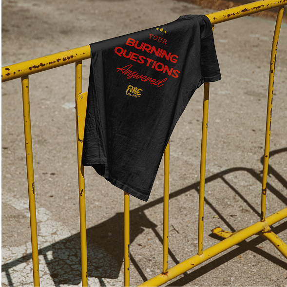
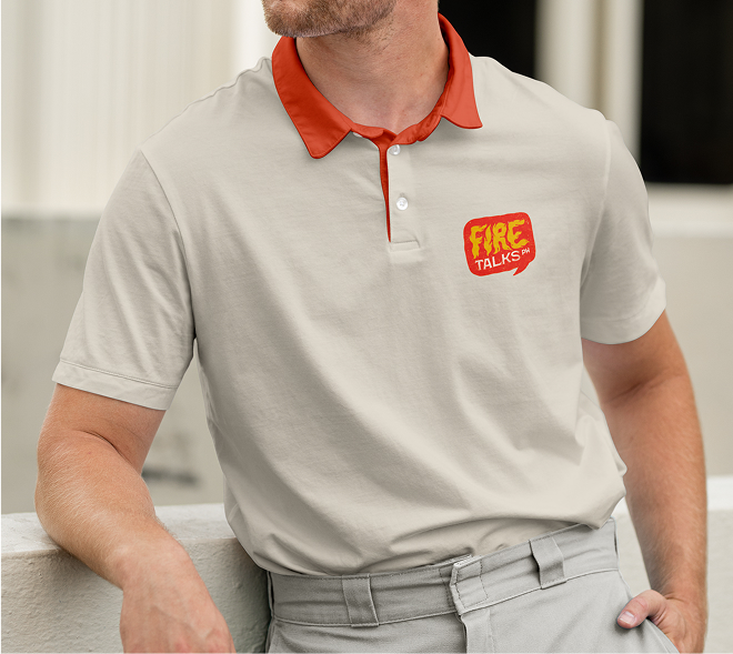
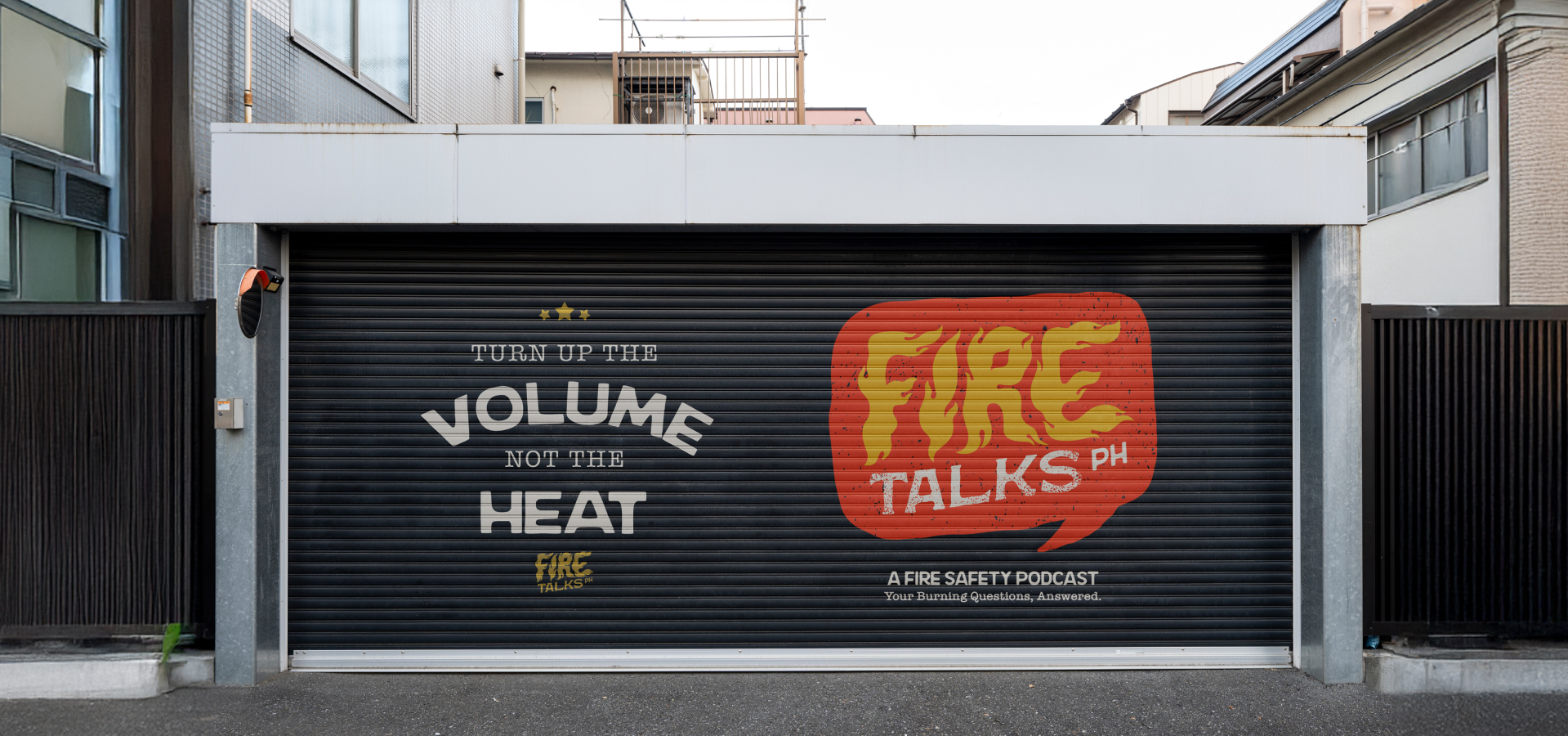
Beyond the screens, the design system we wanted to add tactility through printouts, signage, and apparel. We foresee the brand going to even more complex executions like emergency kits, preparedness guides, and informative materials in the near future.
By leaning into design that feels real and human, we believe the brand can earn trust through character and reliability.