Better-For-You Cravings

Cravewell

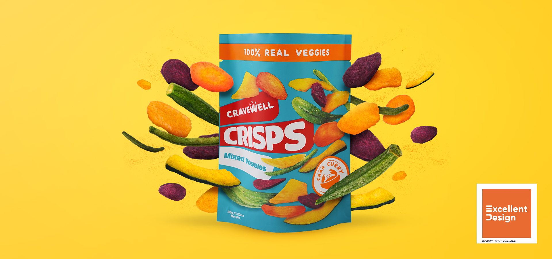
Cravewell emerged as a rebranding of a functional snacks line under Fourtify, Inc., reimagined to stand out in the better-for-you (BFY) space. It already had roots in making wellness accessible, but needed stronger emotional pull, clearer identity, and packaging that didn’t feel restrictive or clinical. Today, Cravewell isn’t just another healthier snack — it’s a friend in the food aisle, encouraging you to enjoy cravings with confidence and joy. Silver Prize : ASEAN-Korea Excellent Design Exhibition Award 2020
Services

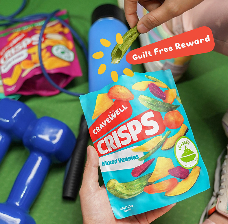
From guilt to delight

BFY snacks often lean heavily into health claims, scientific framing, or even guilt — emphasizing what you can’t have. That creates distance. We saw a gap: people who do want healthier snacks still want joy, flavor, fun, and belonging. And cravings aren’t shameful impulses — they’re signals. If you meet them with better choices, the experience shifts from “I can’t eat that” to “I’m choosing this.” Cravewell’s opportunity was in reframing cravings neutrally and positively.

Your cravings, better satisfied

At the heart of Cravewell is a simple but powerful belief: cravings are neutral. Wellness doesn’t need to feel serious or austere — it can be joyful, supportive, and deeply human. We guided the brand toward something that lifts, affirms, and invites rather than limits: “give in — just better.” That philosophy anchored the name, voice, visuals, packaging, and all touchpoints.

Fun, nourishing, and inclusive

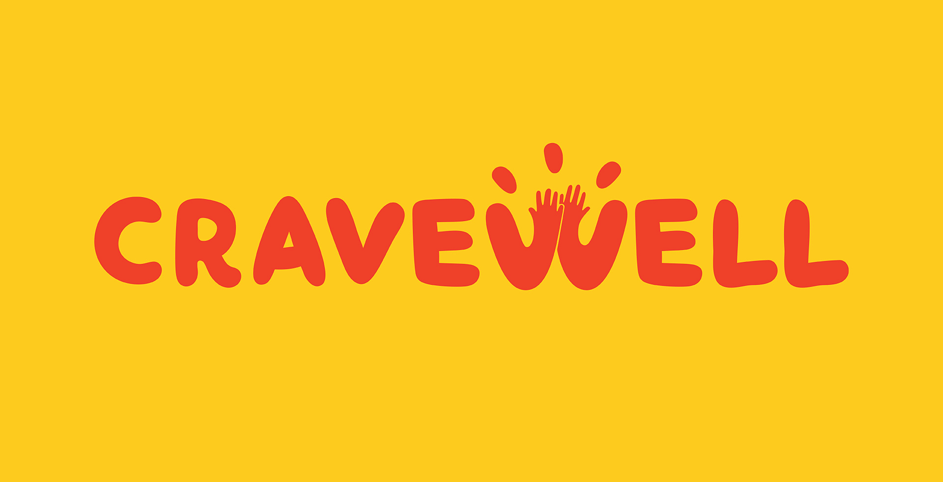
The name Cravewell blends “crave” + “wellness,” flipping the narrative from guilt to satisfaction. It signals immediately that this is a brand that embraces cravings — but better.

The logotype features a stylized “W” shaped like a high-five — a signature gesture of affirmation and encouragement. Surrounding this, we used bold colours, round typography, and playful snack-inspired illustrations — bursts, seeds, sun rays — to bring warmth, energy, and cheer.

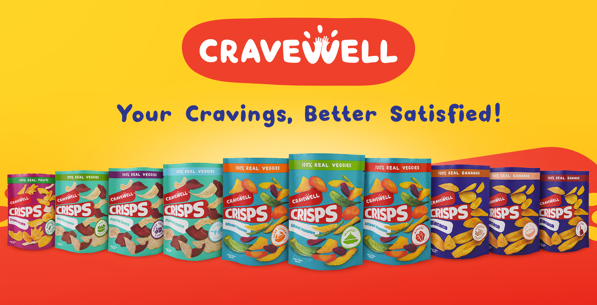
Because Cravewell would have multiple product types, we created a modular packaging system with hierarchy. The structure distinguishes method (e.g. Crisps, Chews, Munch), input (what the snack is made of), flavour, and size.

Each variant uses the same overall layout, consistent logo treatment, and then flavour cues and background colours to help recognition. This way, the line can expand without losing cohesion or shelf presence.

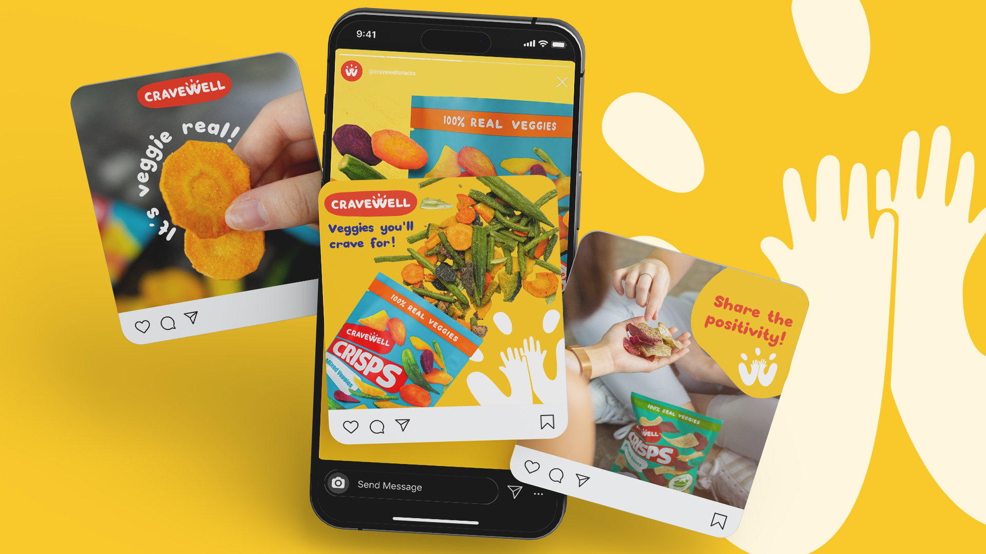
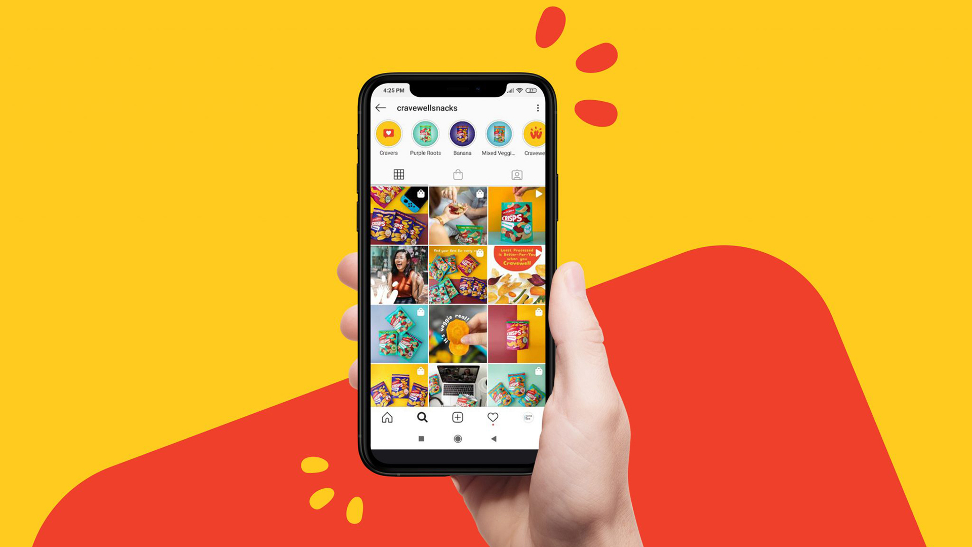
We leaned into warmth, encouragement, no-judgment: snacks are okay. Cravings are okay. What matters is giving in thoughtfully. Key messaging and campaign visuals reinforce positivity: “flavour introductions,” “lifestyle tips,” “snackable affirmations.” Content is snack-friendly not just in food, but in format: bite-size visuals, playful graphics, colors that pop.

From packaging to social media templates, campaign visuals, product launches — everything is aligned. We created adaptable content templates so that new flavours, methods, or messages can be rolled out smoothly without redesign from scratch.

High-Five’s All Around

The rebrand gave Cravewell a clear shelf presence — recognisable not only by name, but by visual cues: the “high-five W,” colour-coded flavours, modular layouts. Emotionally, the brand became more relatable and fun — feedback from consumers indicated people felt invited not judged.

Award recognition came too: the Silver Prize at the ASEAN-Korea Excellent Design Exhibition 2020.t

Lorem ipsum dolor sit amet, consectetur adipiscing elit. Sapien scelerisque magna venenatis non posuere vulputate viverra nunc
Armand Reyes
CEO, The Highlands Group

Year

Together with:

Copywriting – Isay Roque

Build a Brand That Works

If you’re looking to clarify your brand strategy, refine your brand identity, or create a cohesive brand experience, let’s design something together.