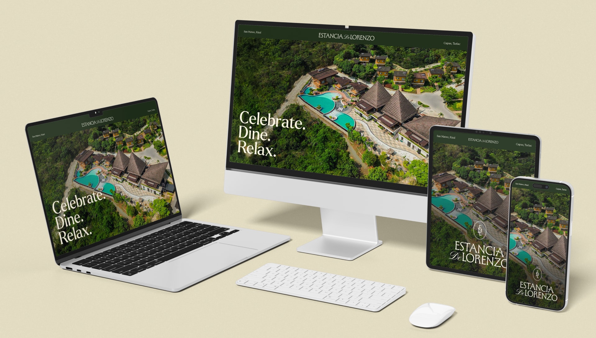
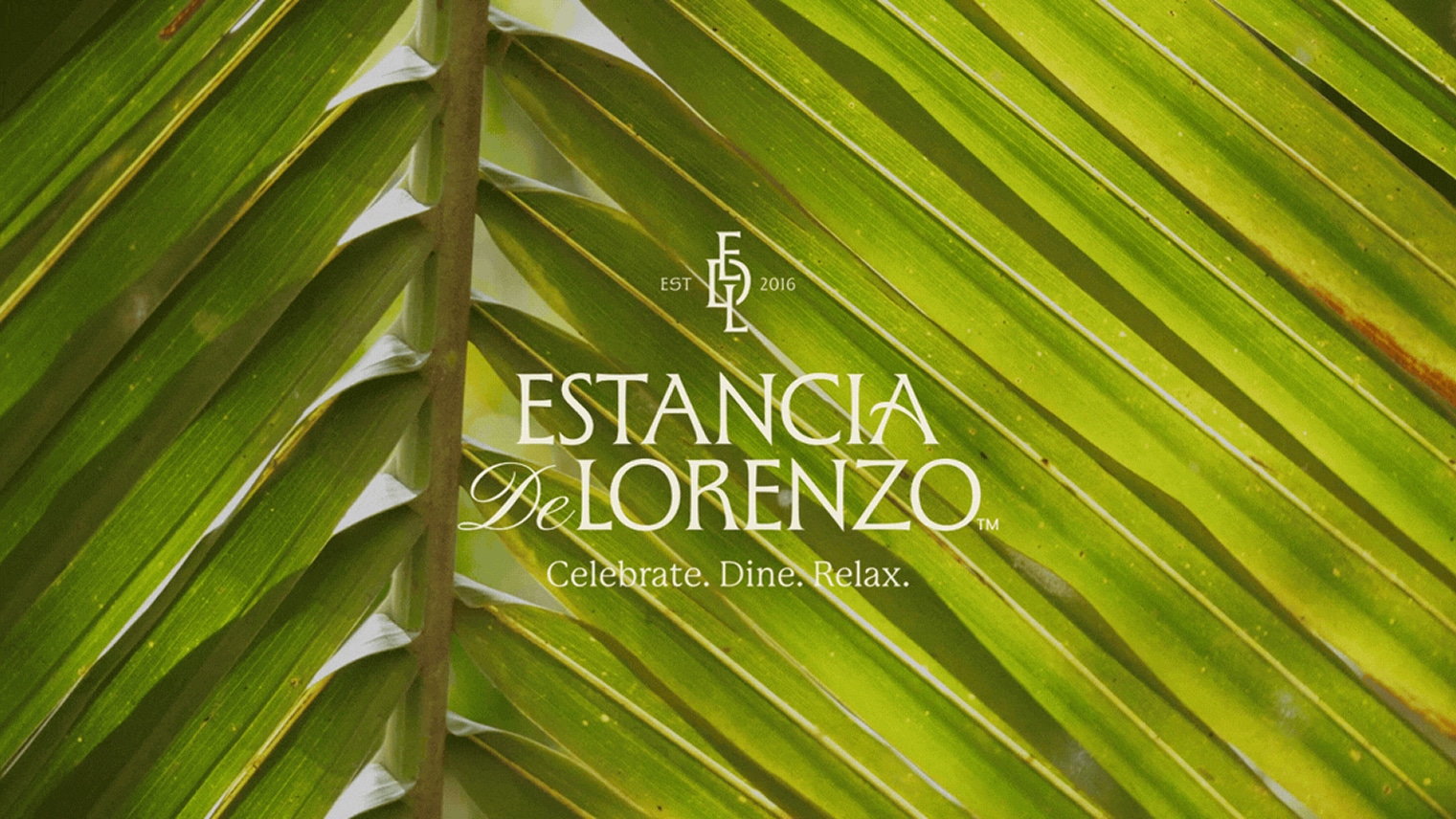
Estancia De Lorenzo is a serene villa-style resort that blends nature, comfort, and elegance. Set in three locations, it offers thoughtfully designed venues for leisure and events, providing a refreshing escape that feels both elevated and welcoming.
TWD developed a visual identity system that honours the resort’s family-estate heritage, solidifying its legacy and recognisable presence.
Services
Brand Audit, Visual Identity
Home For All
Estancia de Lorenzo welcomes a wide range of guests: families looking for time together, corporate planning activities, and day visitors searching for a slower pace.
The desire to step away from the everyday and reconnect—with nature, with other people, or simply with themselves—brings them to the resort. The new identity reflects this balance of comfort, hospitality, and natural surroundings, positioning Estancia as a destination for both memorable occasions and everyday retreats.
Legacy-Driven Identity
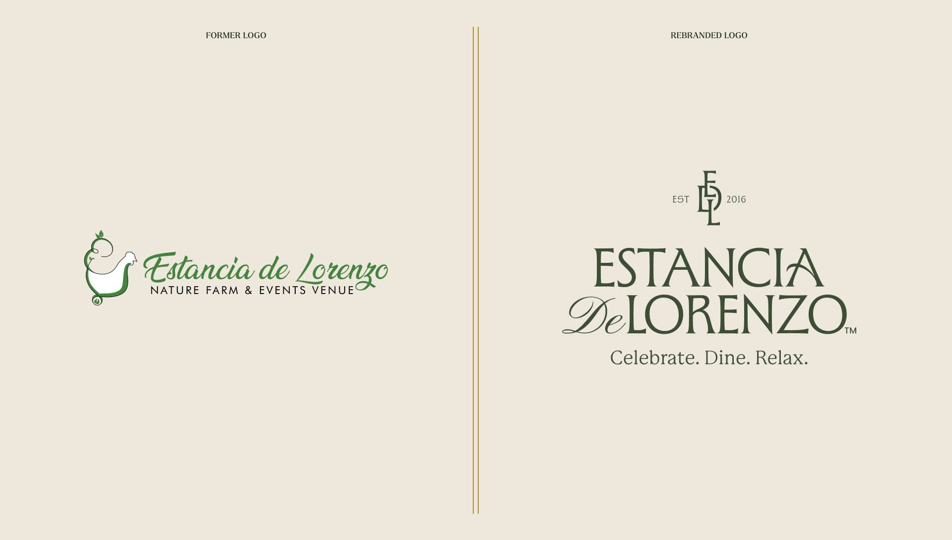
The rebrand centered on creating a legacy-driven identity that reflects Estancia de Lorenzo’s heritage while elevating its position as a premium destination. The challenge was to develop a distinctive logo and visual system that honoured the resort’s roots as a family estate, communicated trust and sophistication, and strengthened brand recognition. It also needed to address years of identity theft and scams by giving the brand a more ownable and enduring presence.
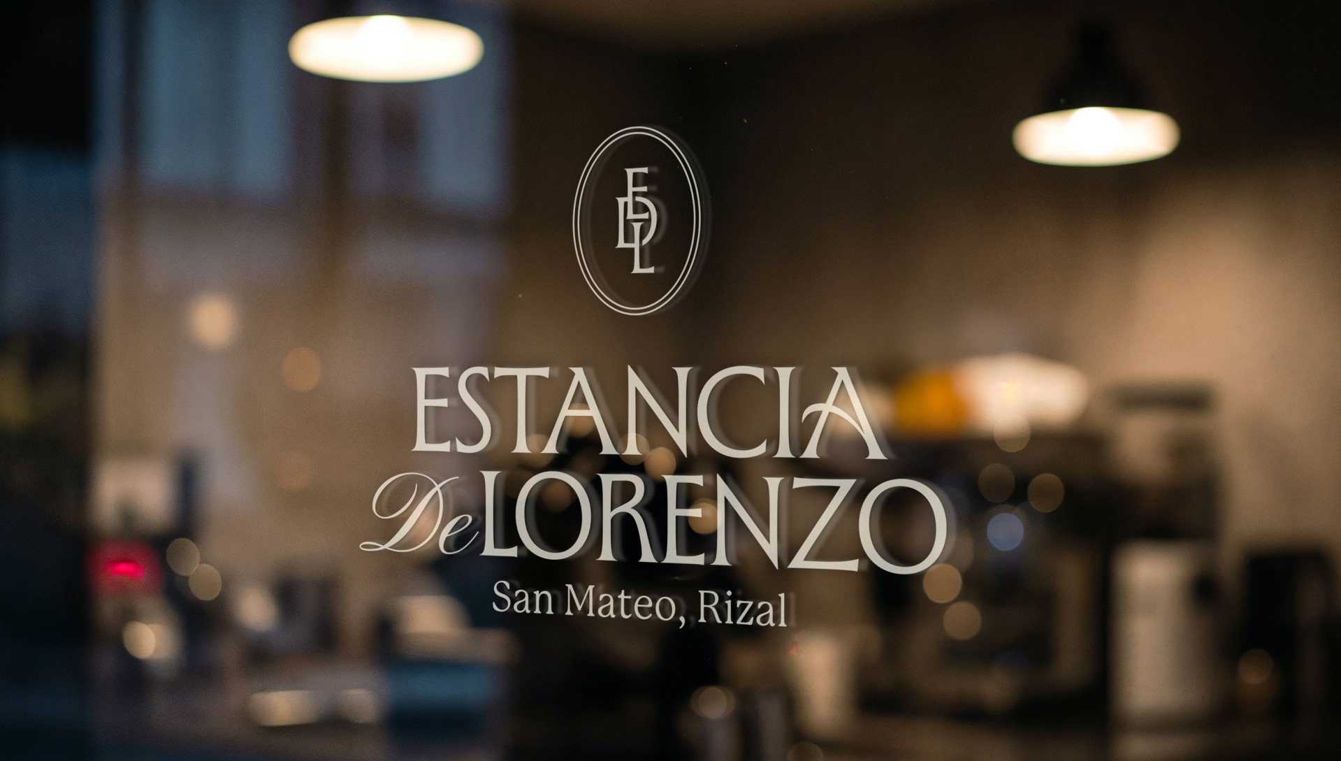
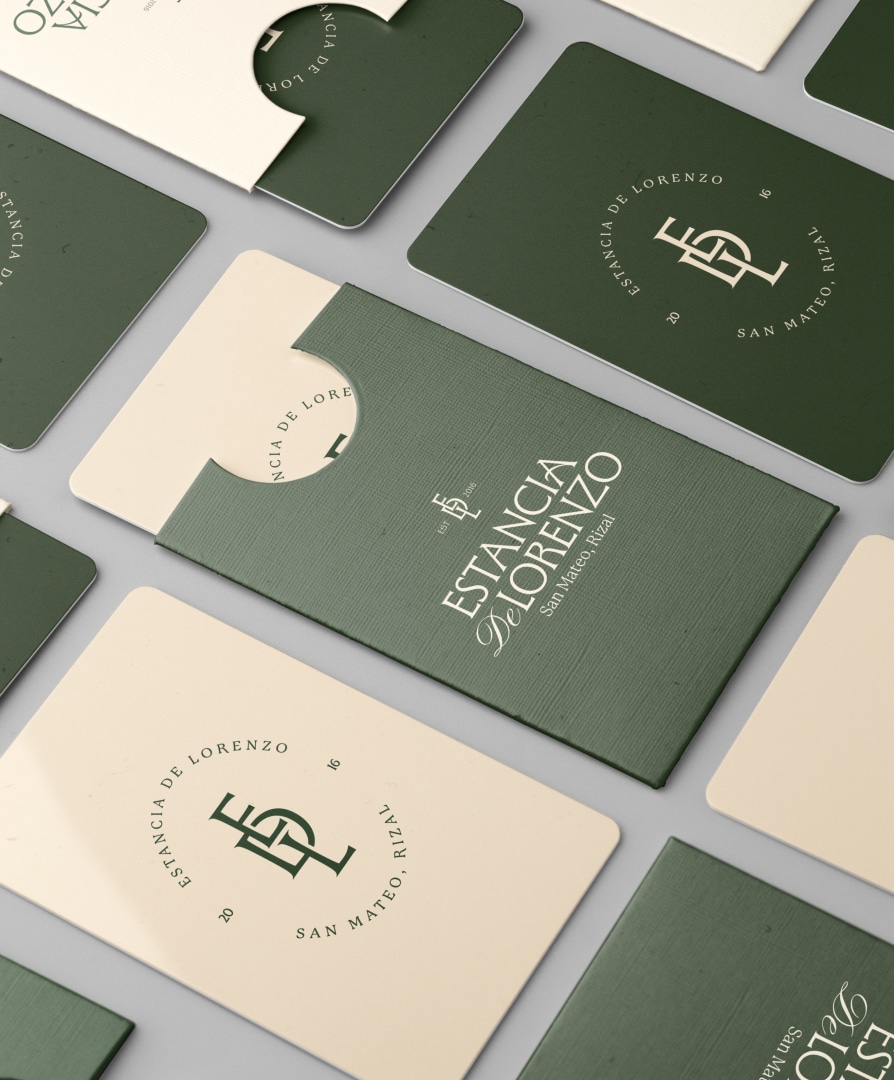
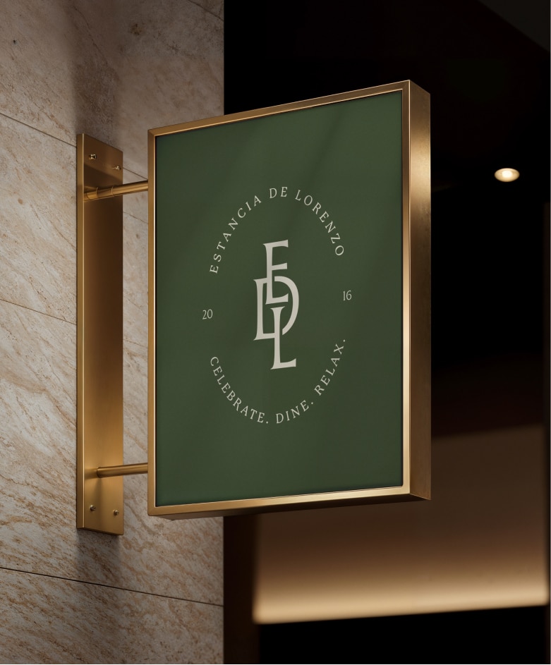
The new identity builds from the initials of Estancia de Lorenzo, combining them into a monogram that also functions as a crest. It gives the resort a distinctive symbol—one that feels established, personal, and connected to its history.
Suite Life
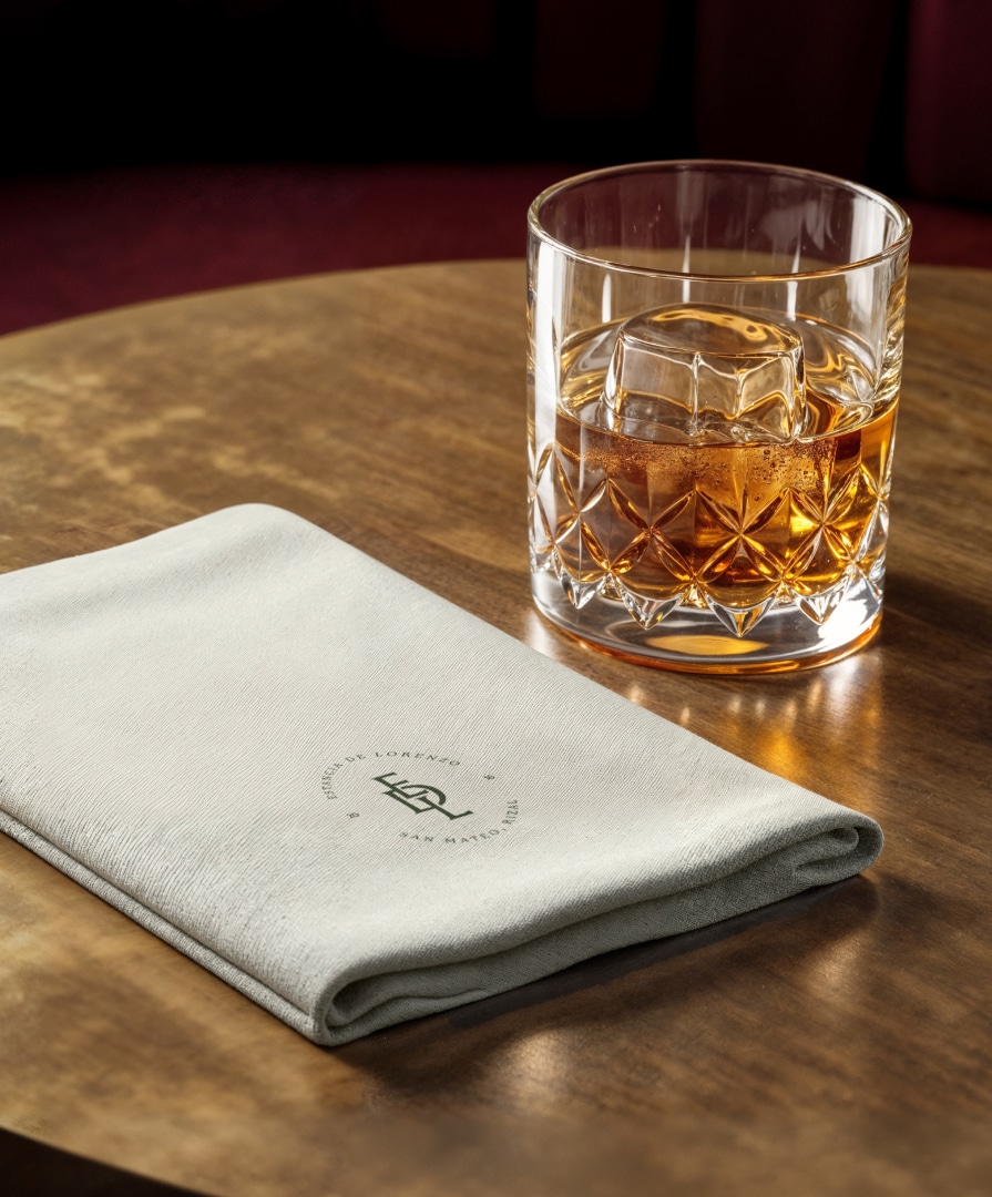
The identity is designed to work across the many surfaces and settings that make up the Estancia experience.
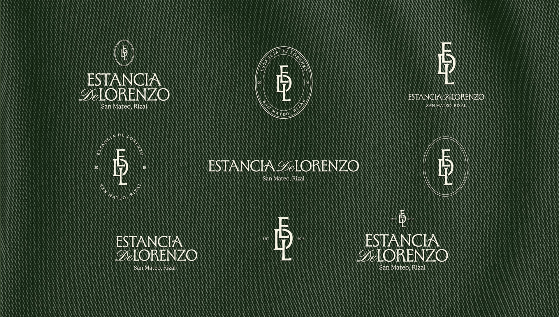
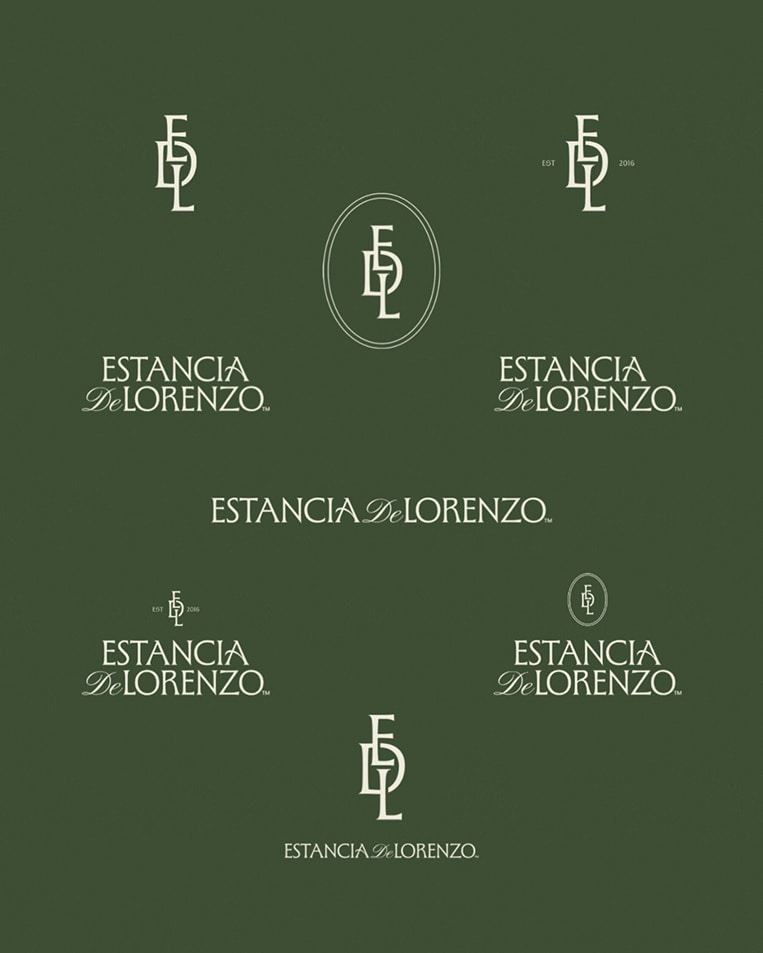
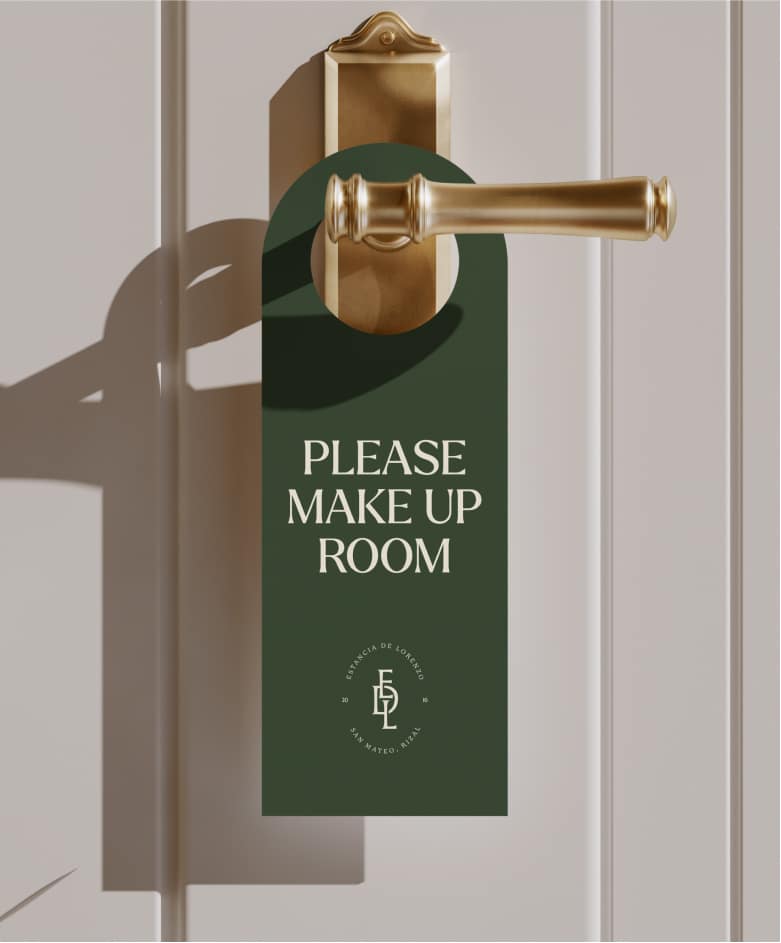
The logo suite includes a full wordmark, a monogram, and a crest, with flexible lockups that can be used across everything the resort needs—from toiletry bottles to vehicle wraps.
The system includes versions with the resort name alone, versions with the tagline, and location-specific versions for San Mateo, Rizal and Capas, Tarlac. In total, the logo suite comprises 36 lockups and variations, giving the brand enough flexibility to remain consistent across both intimate and large-scale applications.
Natural Serenity
The visual system brings Estancia de Lorenzo’s core attributes to life through a balance of heritage, nature, harmony, and convenience.
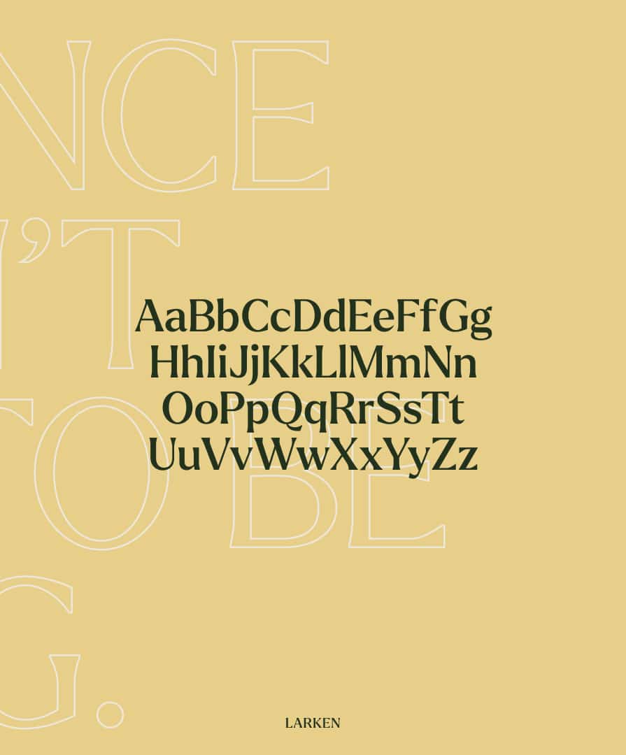
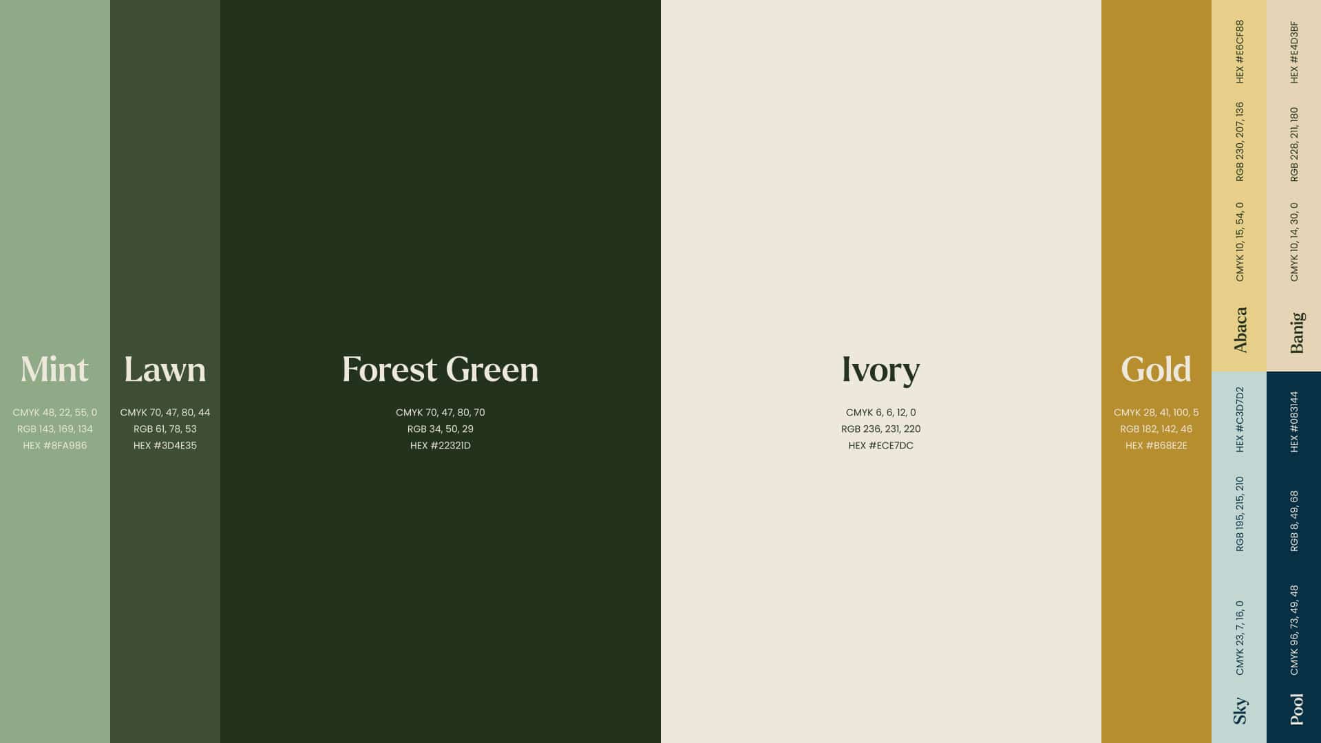
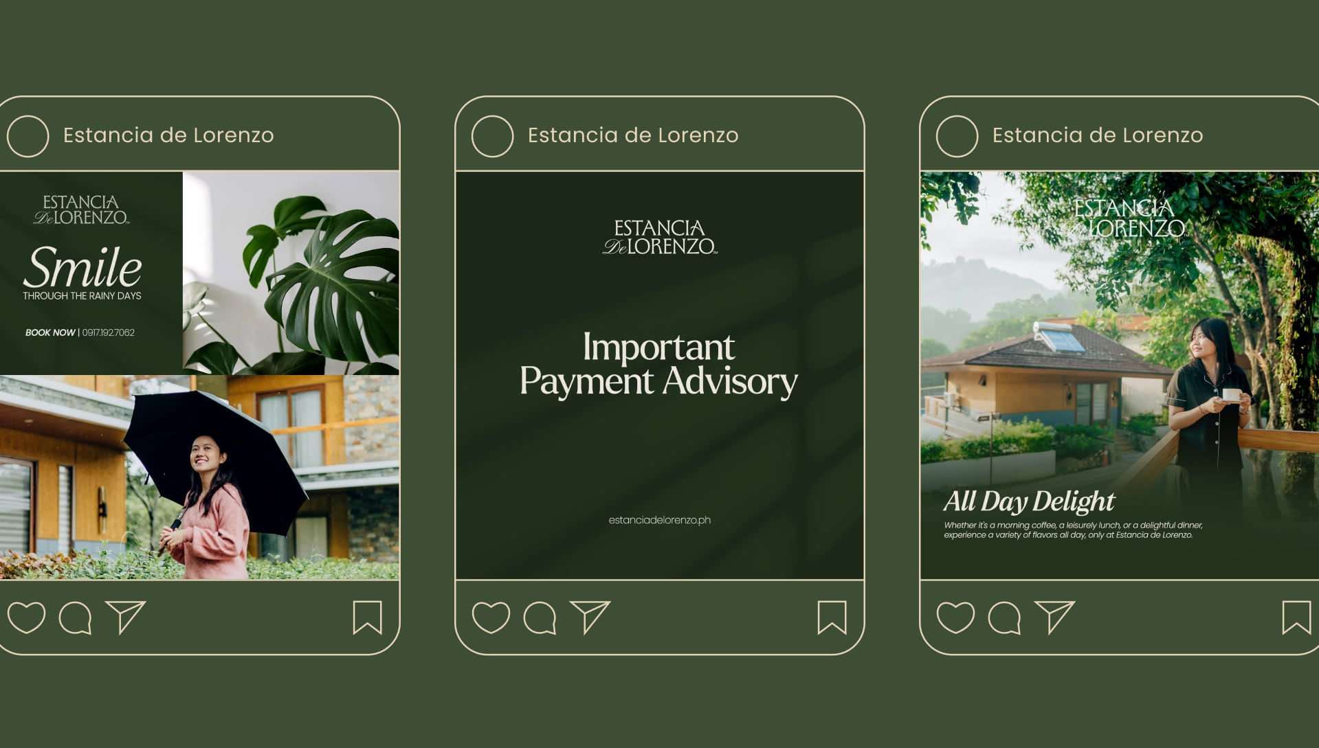
The color palette draws from the resort’s natural surroundings while giving the identity enough warmth and sophistication for celebrations and premium hospitality. Elegant typography and considered layouts extend this balance across the brand’s communications.
The result is a more distinctive and recognisable Estancia de Lorenzo, one that is true to their family history, open to different kinds of guests, and ready to grow into the many ways people come together.