Mori & Mill is a café and all-day dining destination built around the idea of a third space: somewhere to enjoy good coffee and food, and to connect with family and friends. Our visual identity for Mori & Mill creates a breathing space for these moments to happen naturally.
Services
Visual Identity
Quiet Rituals
Every day begins with quiet rituals. Rice washed by hand, dough resting patiently, beans slowly roasted until their aroma fills the room. These small moments, often unseen, are where care lives.
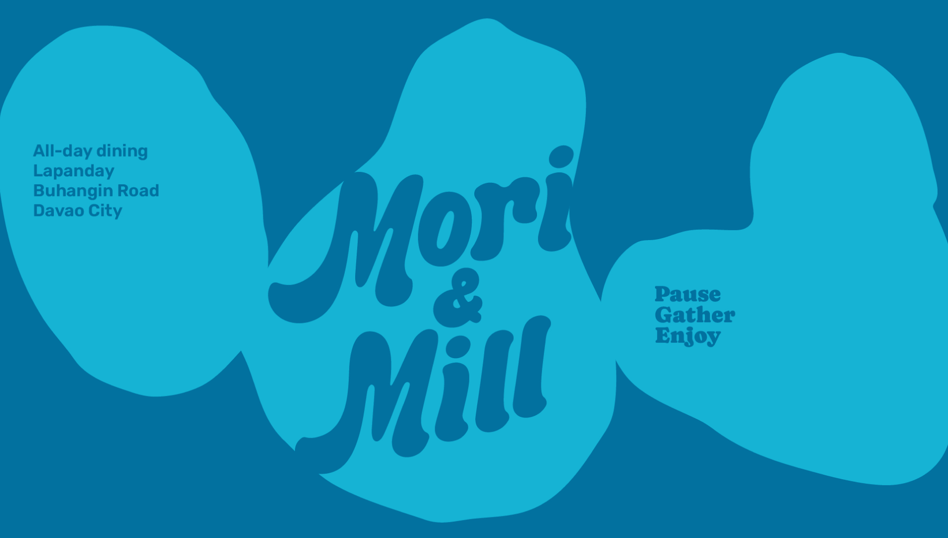
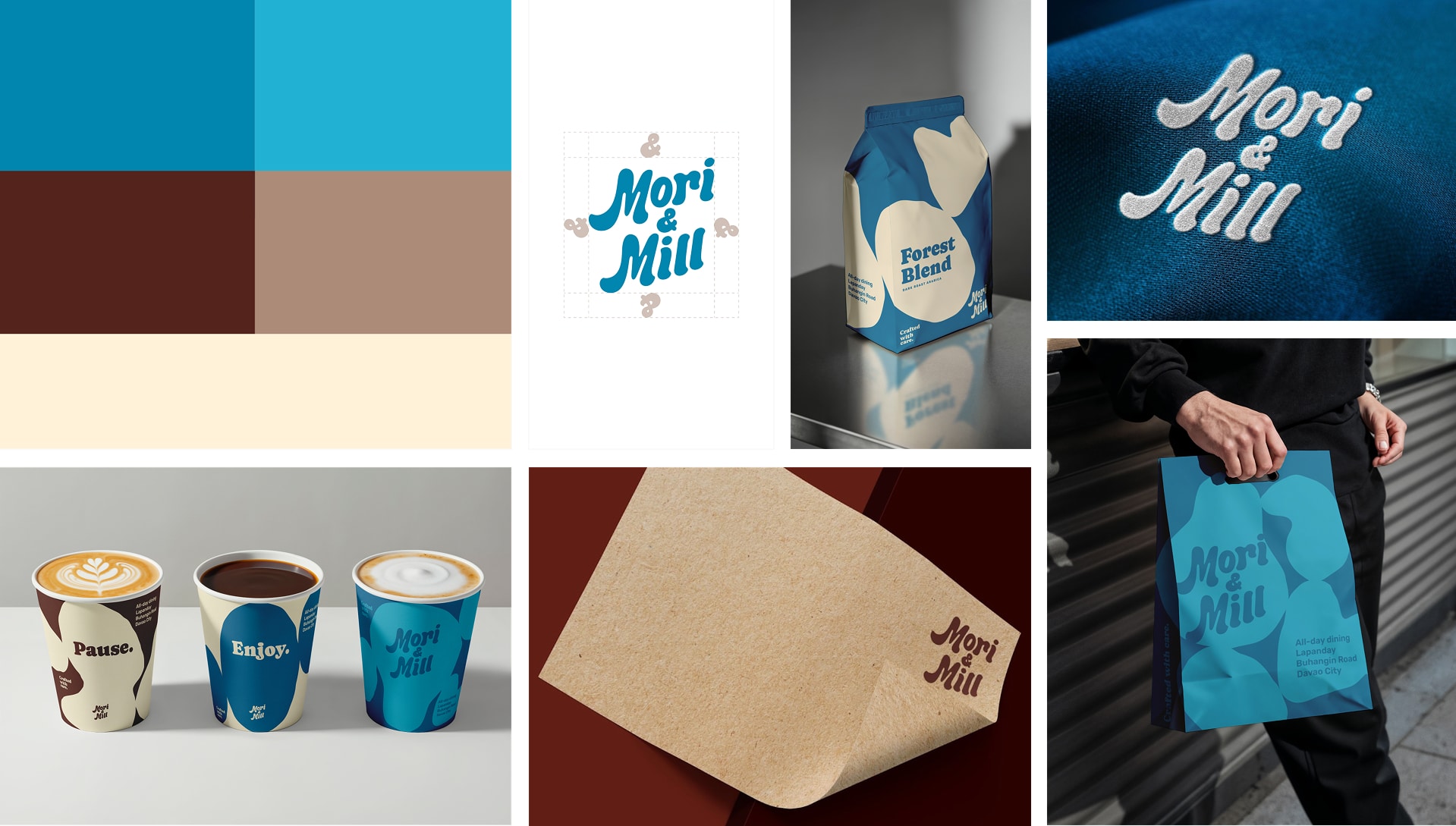
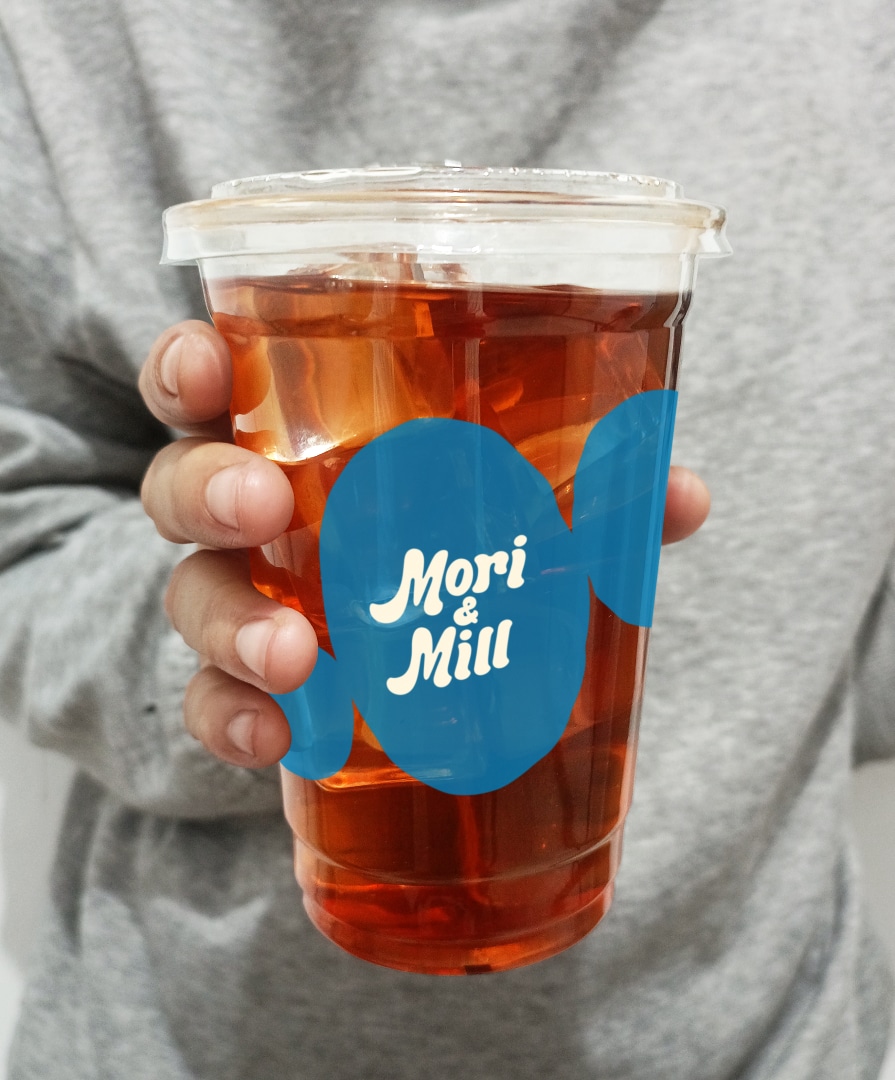
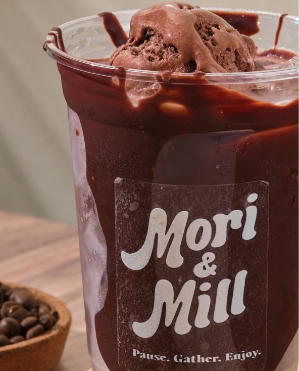
Mori & Mill’s visual identity draws from this sense of care and intention. The rounded, hand-drawn wordmark gives the brand a personable character, while cream and brown tones are balanced by a lively blue. Organic shapes add movement and flexibility across the visual system, creating something warm, friendly and inviting without becoming too loud or overly polished.
A Space for Balance
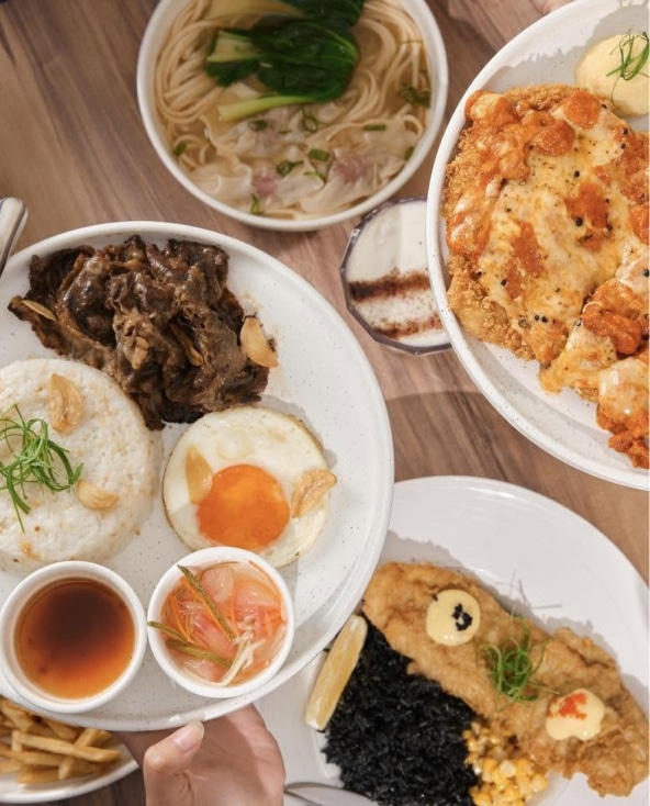
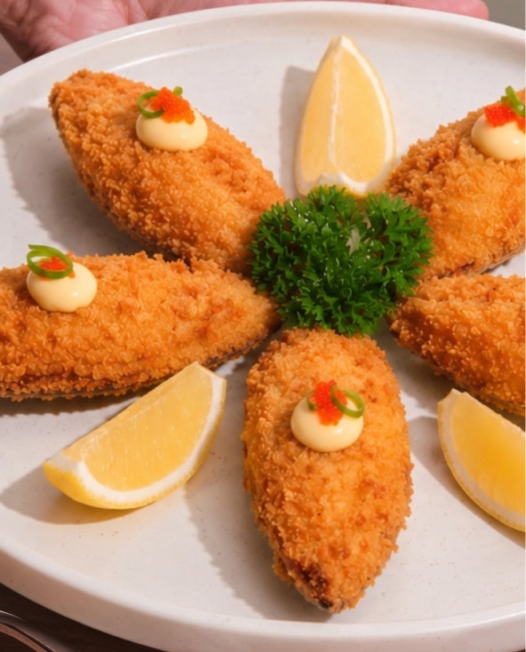
Across Asia, food has always been a nurturing act. It is shared, unhurried and made with respect for time and ingredients. From comforting meals to thoughtful pastries and carefully brewed coffee, each offering carries a sense of calm and intention.
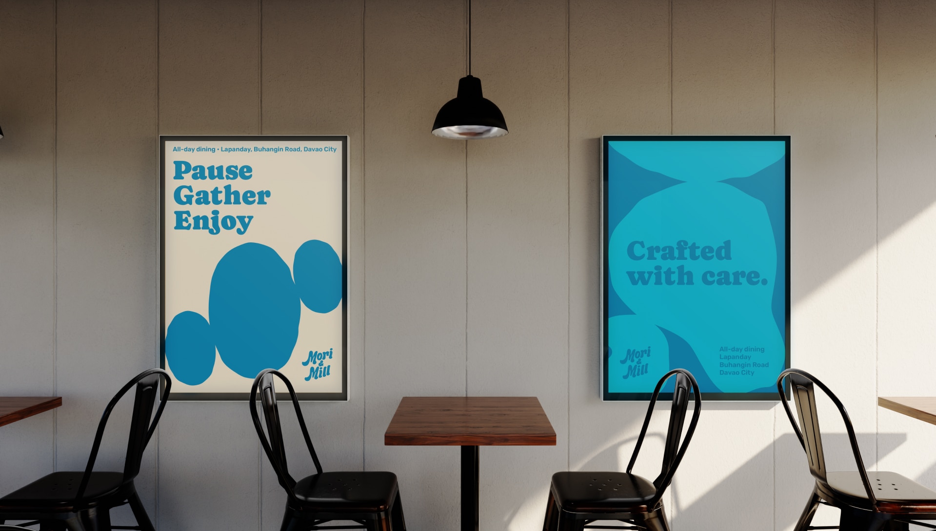
We believe the best flavours come from balance—tradition and modern life, simplicity and curiosity. Rather than making the brand compete for attention, the identity leaves room for the experience itself. It lets the food, the space and the people take the lead.
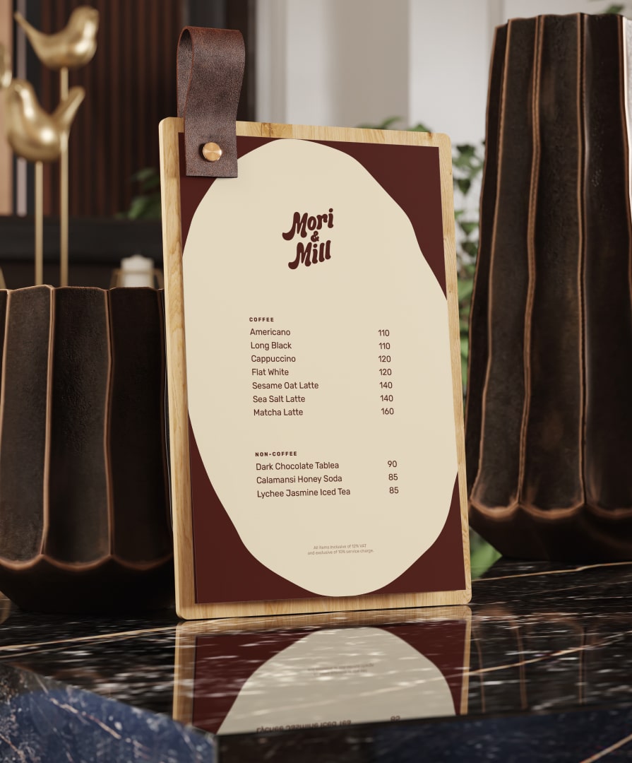
The visual system carries easily across Mori & Mill’s everyday touchpoints, from menus and takeaway cups to paper bags, apparel and other branded merchandise. Its organic elements make the brand recognisable, while its overall restraint keeps the experience relaxed.
Comforting Third Space
The successful launch of Mori & Mill established it as a beloved all-day dining destination and a go-to third space for the Davao community. By combining thoughtfully crafted Asian-inspired cuisine with a warm, contemporary atmosphere, the brand has become a place where people naturally gather—whether to work, connect, unwind or simply enjoy a moment of calm.
Its balance of energy and comfort has fostered a loyal following, making Mori & Mill a meaningful part of everyday life in the city.