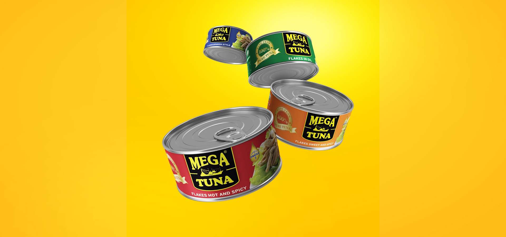
Simple elegance, big visibility
Amid rows of visually noisy tuna labels, Mega Tuna had space to stand out through clean design, not gimmicks. We had the opportunity to make integrity look intentional, and we did so through readability and honesty.
Vibrant trust in every glance
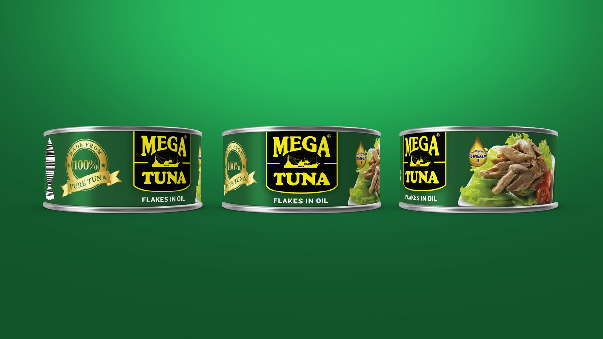
Our guiding idea was to let the label speak for itself with bold shapes, confident color, and subtle details. We aimed for recognition and quality cues in a single glance.
Where clarity meets purpose
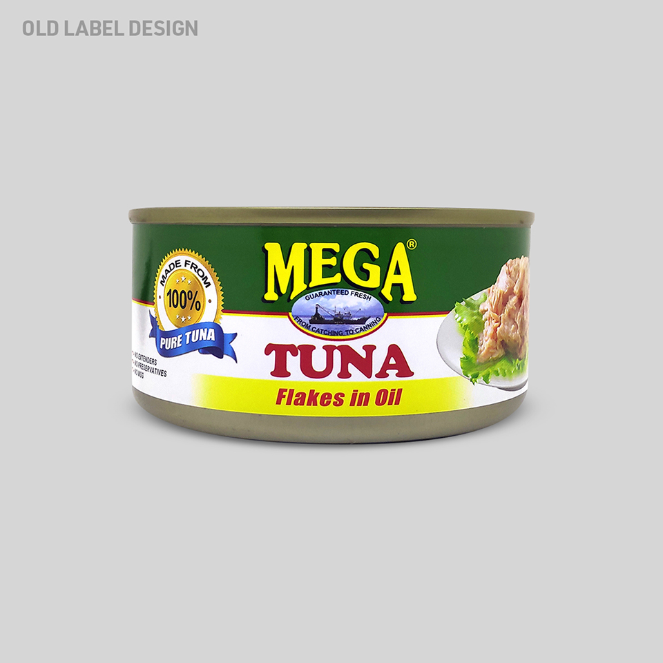
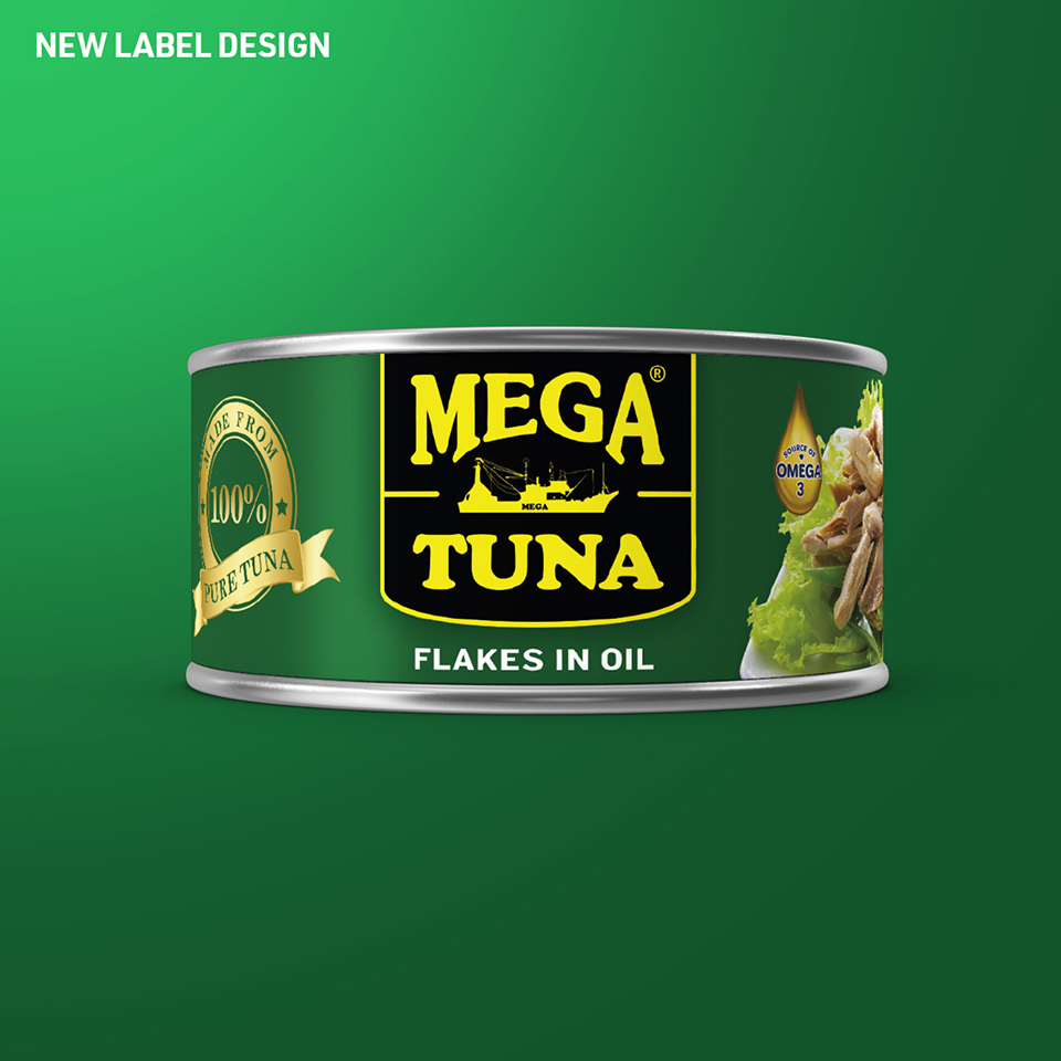
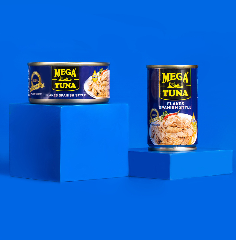
We began by refreshing the brand’s personality by making it feel modern and approachable without losing its practicality. The hierarchy of information was restructured so the brand name and key claims were unmissable, even from a distance.
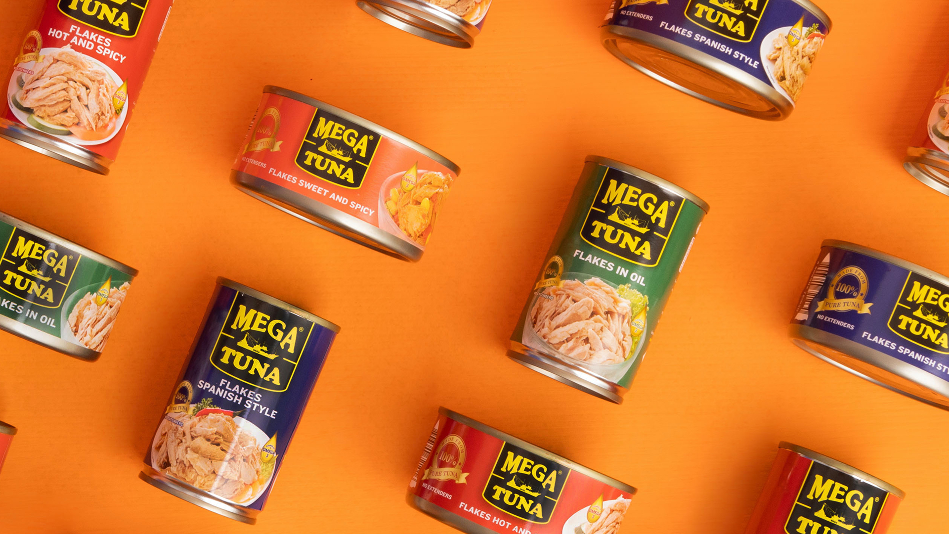
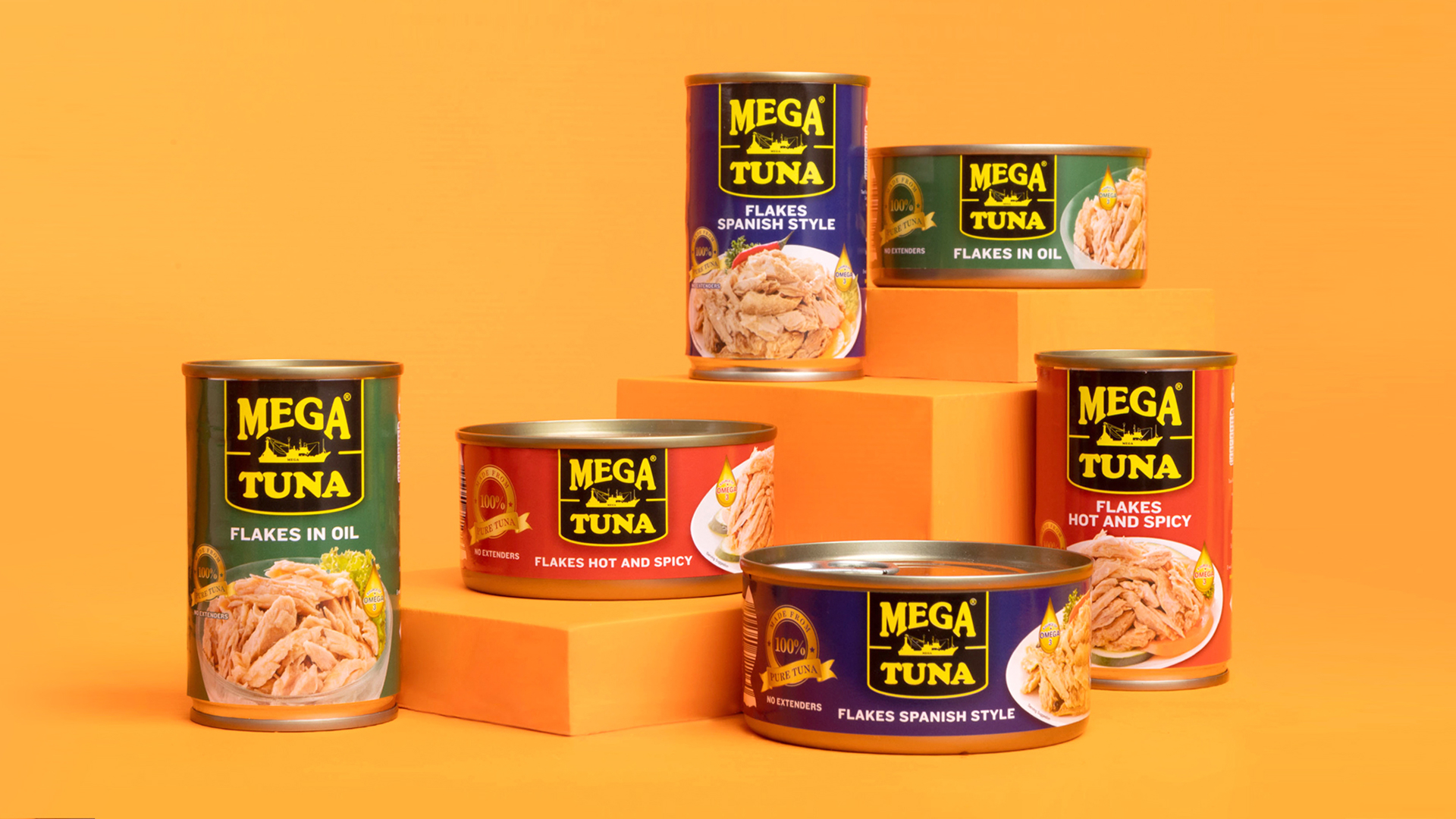
Color blocking became a key tool: bold, differentiated palettes for each variant create instant recognition while preserving a unified brand family. Clean typography supports this system, designed for quick readability in busy supermarket aisles.
The result is packaging that feels fresh but not over-designed. Every decision, from bolder logos to simplified product cues, was made to help shoppers feel trust, confidence, and even pride in choosing Mega Tuna.
Presence that speaks without shouting
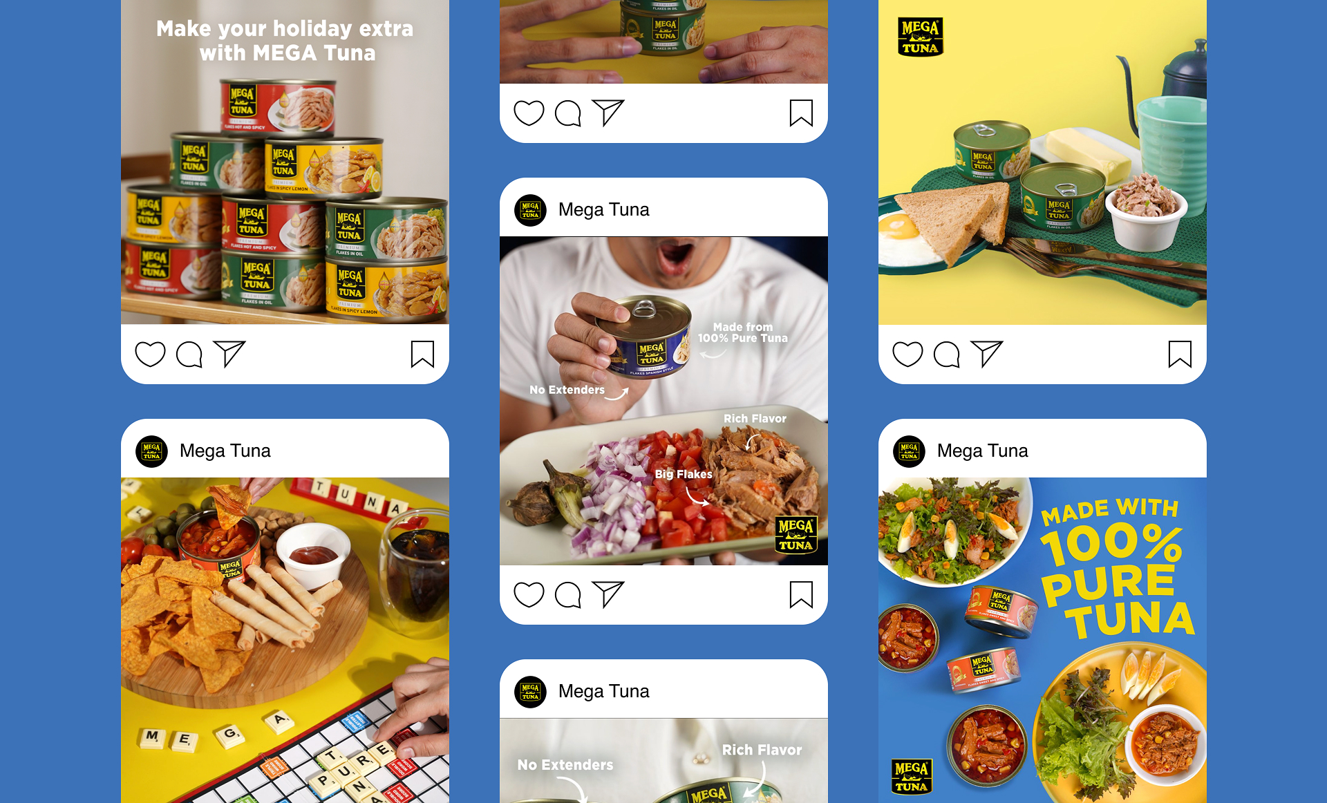
Now, Mega Tuna doesn’t simply sit on the shelf; it announces itself. In sari-sari stores, wet markets, and supermarkets alike, its design registers fast thanks to its familiarity, reliability, and refreshing sincerity. The brand transitions from “new product” to “trusted staple.”