Breaking up with Telcos

Circles.Life

Circles.Life stands as one of Asia-Pacific’s most daring telcos, reshaping what mobile connection means for a new generation of digital natives. In both Australia and Singapore, the brand thrives by challenging legacy players with bold communication, playful energy, and a promise of giving people more control over their mobile experience.

Services

Consistency at scale

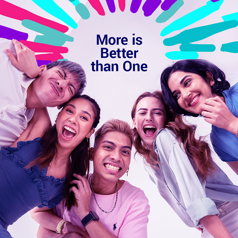
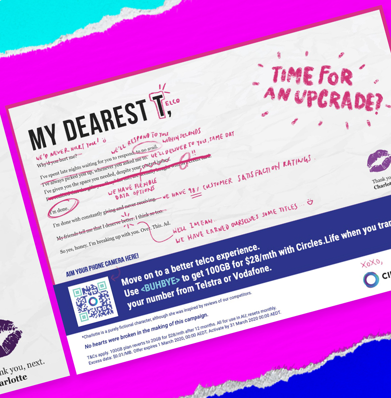
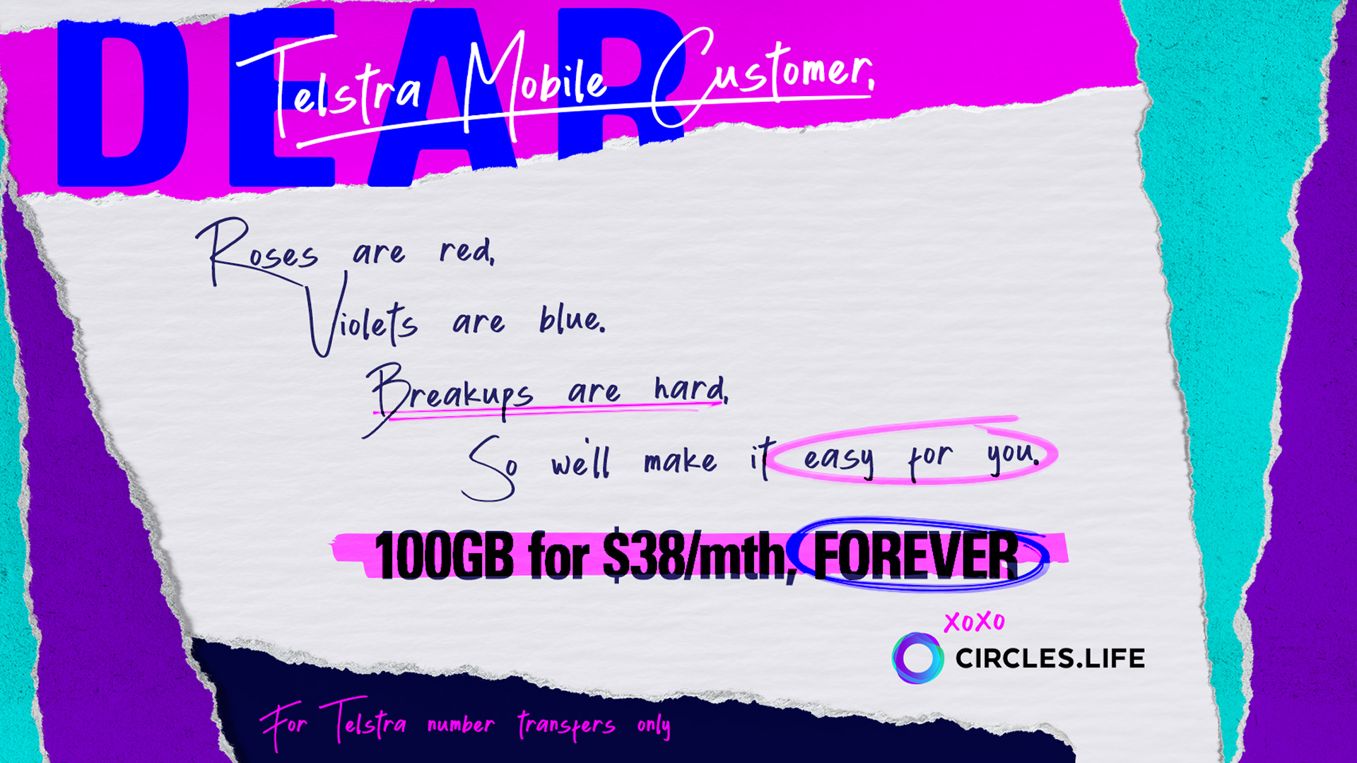
Our guiding idea was to amplify emotion and rebellion. Whether through heartbreak letters to old telcos or powerful affirmations of strength, the visual language had to dramatize what Circles.Life stood for: breaking free, saying goodbye, and moving forward with something better.

Redefining mobile freedom

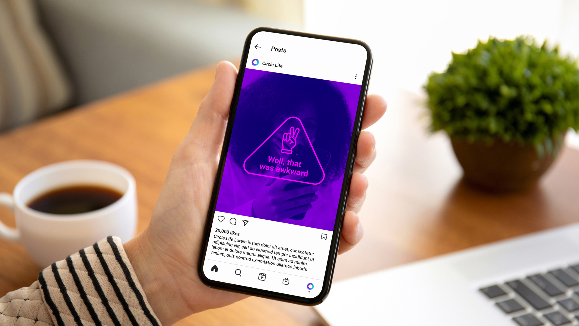
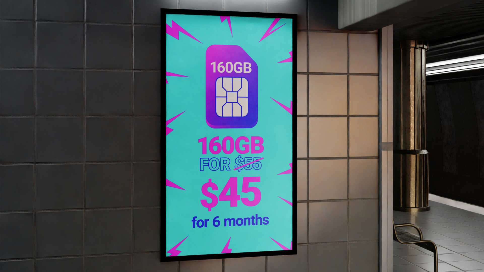
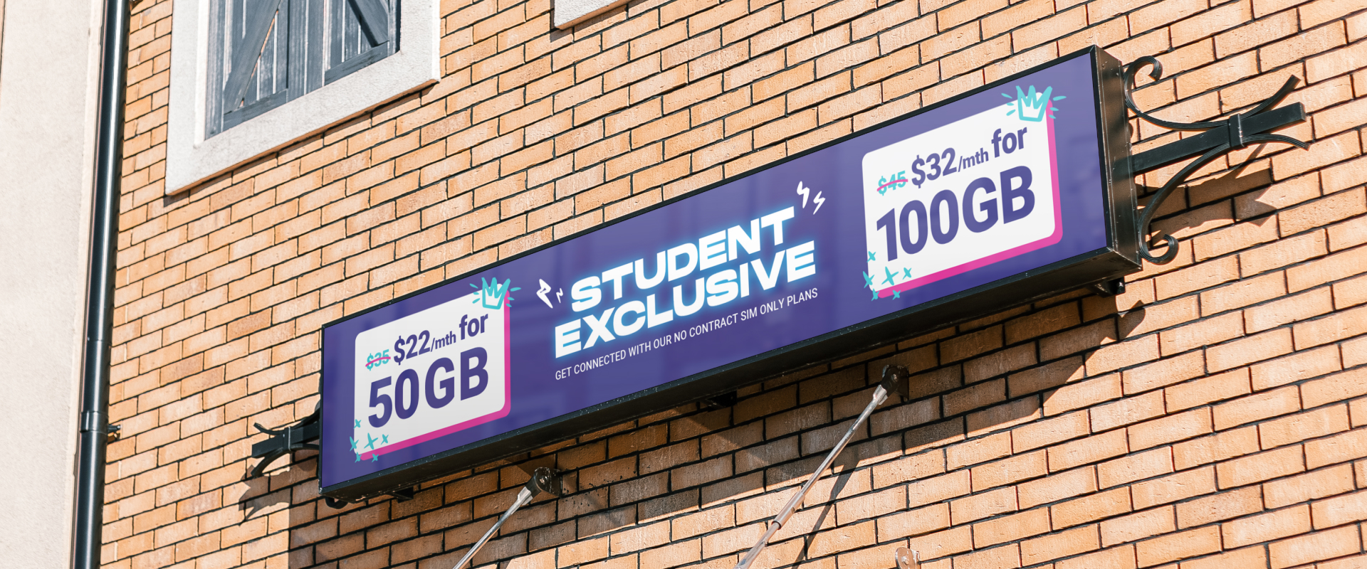
We executed a scalable design system: handwritten notes, torn pages, textured icons, bold Univers typography, and high-energy photography and motion. Across Singapore and Australia, this visual language cascaded into everything from OOH and social to Woolworths POSM mockups, SIM packaging, retail displays, and animated motion graphics.

Electric, textured, bold

The result was a sharper, bolder Circles.Life identity, one that gave both markets the flexibility to run multiple campaigns without losing consistency. Every piece of communication carried the same pulse of energy, helping the brand remain top of mind as the fearless alternative to traditional telcos.

Breakup letters gone viral

The “Thank You, Next” campaign struck a nerve. 100 funny and raw breakup letters were written to rival telcos, and it became a cathartic moment for audiences ready to move on.

Lorem ipsum dolor sit amet, consectetur adipiscing elit. Sapien scelerisque magna venenatis non posuere vulputate viverra nunc
Armand Reyes
CEO, The Highlands Group

Year

Together with:

Build a Brand That Works

If you’re looking to clarify your brand strategy, refine your brand identity, or create a cohesive brand experience, let’s design something together.